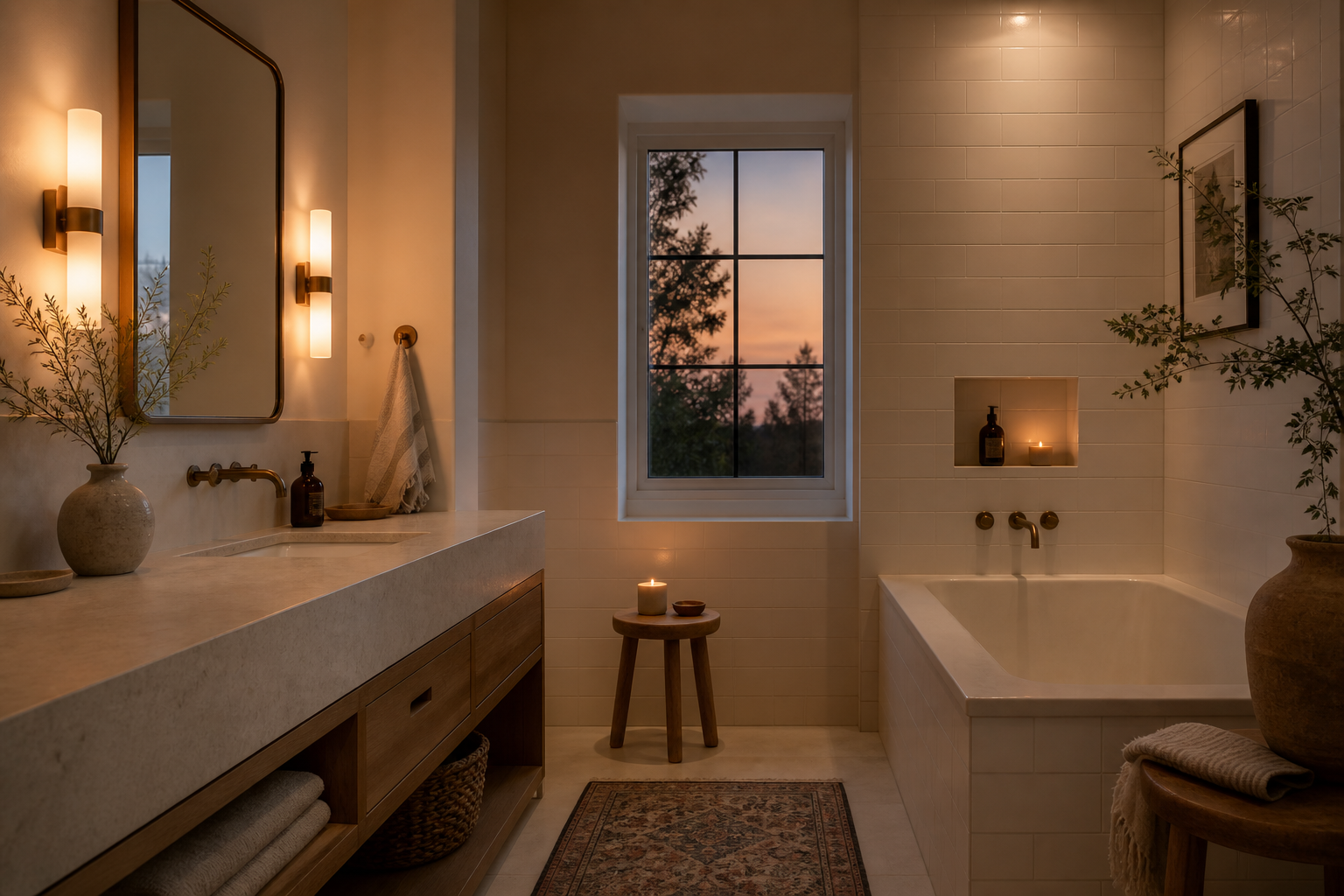
A bathroom feels clinical when the light is blue-white, the materials have no visual weight, the proportions do not relate to the human body, and the room echoes. Calm is the result of getting those four things right, not of choosing spa accessories.
This is the distinction most homeowners miss when they describe wanting a bathroom that feels like a retreat. They reach for the visual vocabulary of spas: eucalyptus bundles, stone trays, rainfall heads, white-on-white tile. Those objects signal relaxation in photographs. They do not produce calm in a room that is lit like an operating theater, scaled like a public restroom, and finished with surfaces that reflect every sound.
Calm is a sensory condition. Clinical is a sensory failure. The difference is mechanical, not decorative.
What Clinical Actually Means in a Bathroom
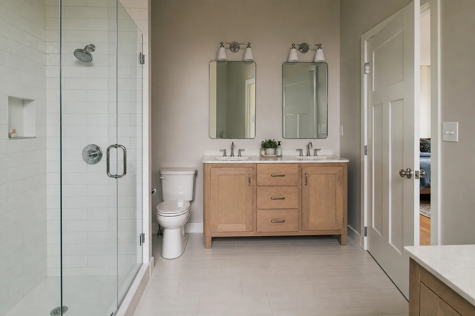
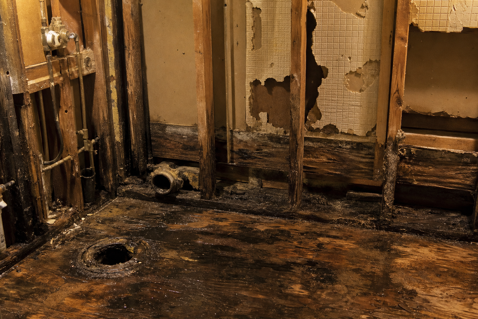
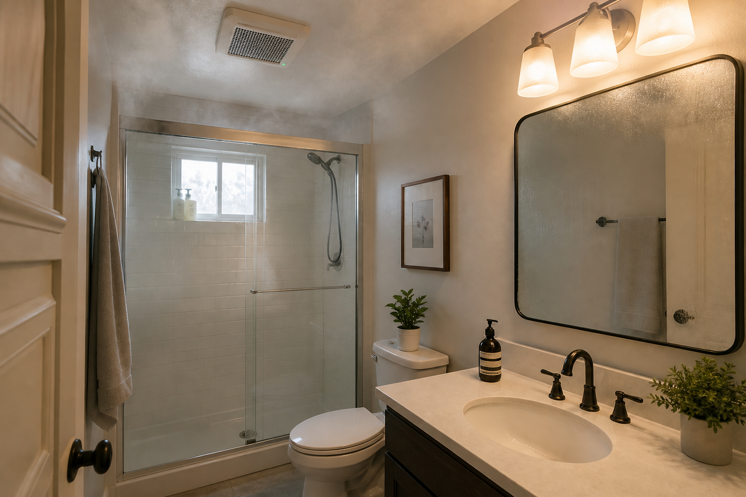
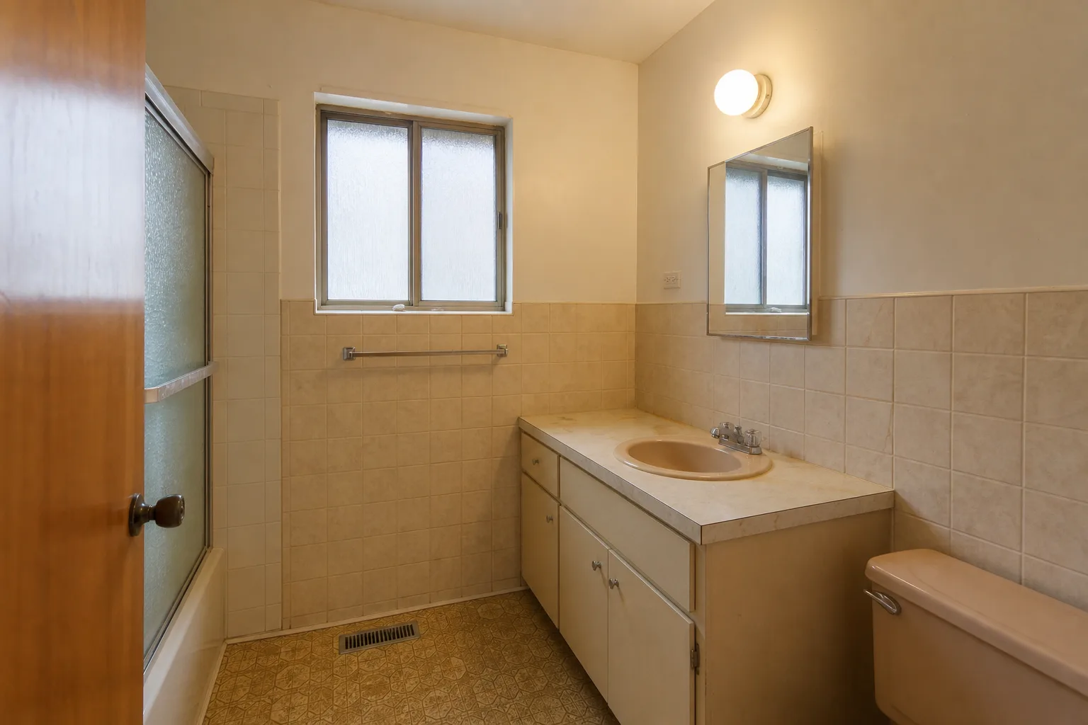
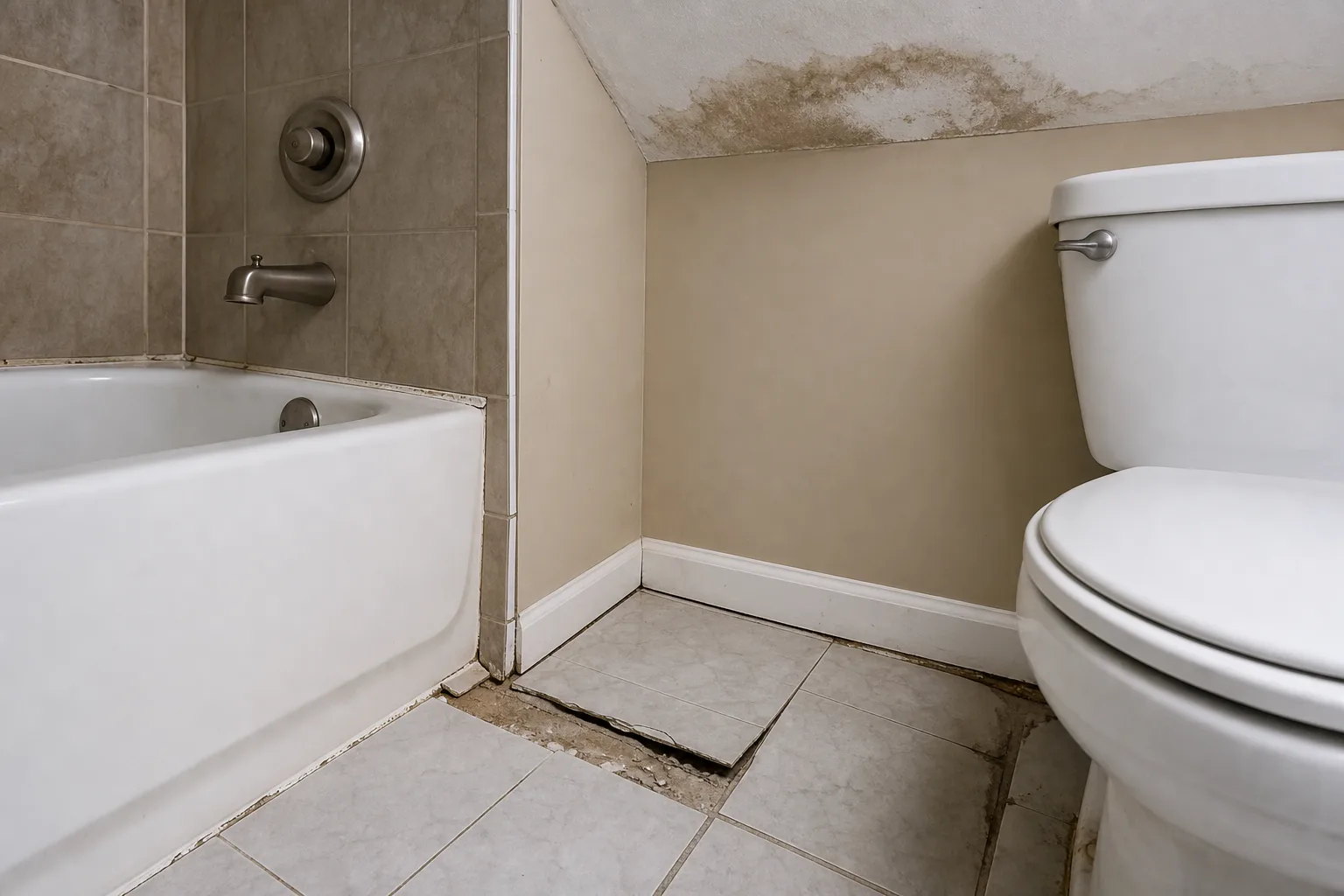
Clinical is not a style. It is a set of conditions that produce a specific feeling: bright, hard, echoing, and slightly impersonal. You recognize it immediately. Fluorescent light on white tile. Chrome fixtures on white porcelain. A mirror so large it dominates the wall. A vanity that sits too high or too low. Footsteps that announce themselves. Water that sounds like it is hitting a drum.
The clinical bathroom is optimized for cleanliness as an appearance rather than comfort as an experience. It reads as hygienic in a photograph and feels exhausting to inhabit. Most homeowners who say they want calm are reacting to one or more of the four conditions that produce clinical, even if they describe the problem differently.
"I want it warmer" usually means the color temperature is wrong. "It feels cold" may mean the materials have no visual weight. "It feels like a hotel" often means the proportions serve the photograph, not the body. "It feels loud" means the acoustics are untreated. Each complaint maps to a specific variable. Treating all four as one problem produces spa accessories on a clinical foundation.
Variable One: Light Temperature and Layering
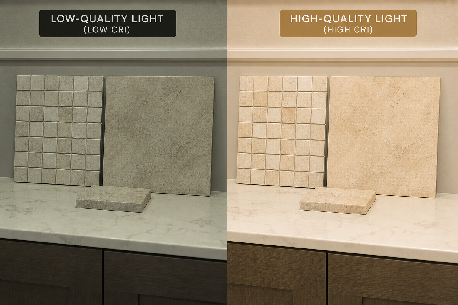
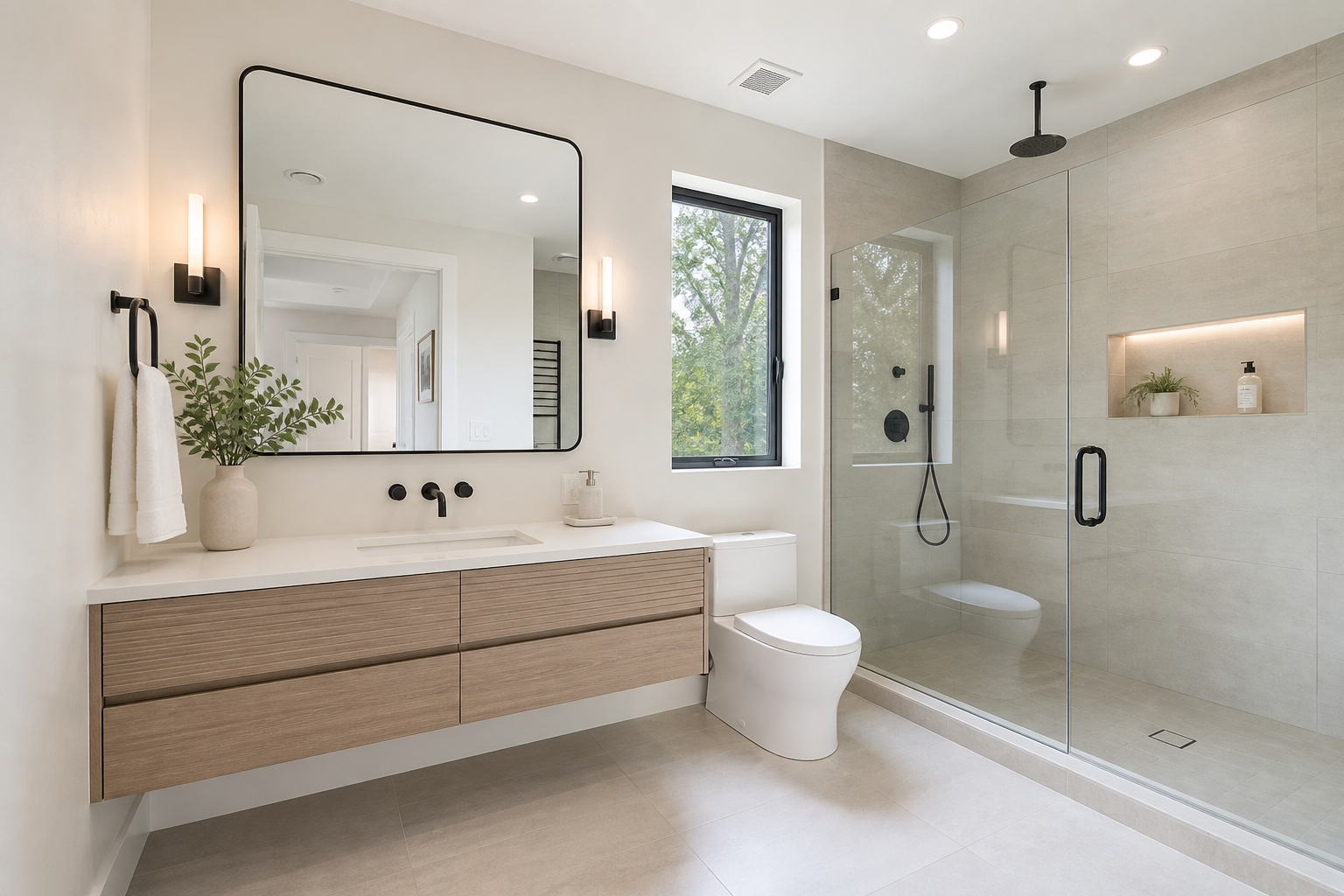
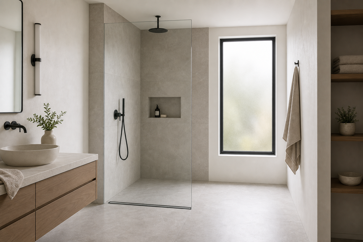
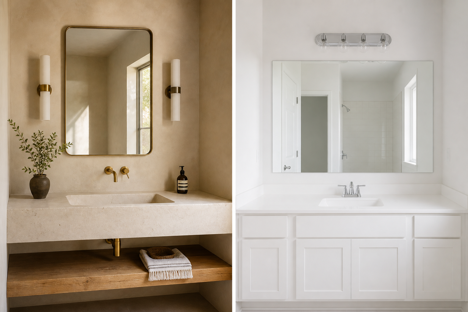
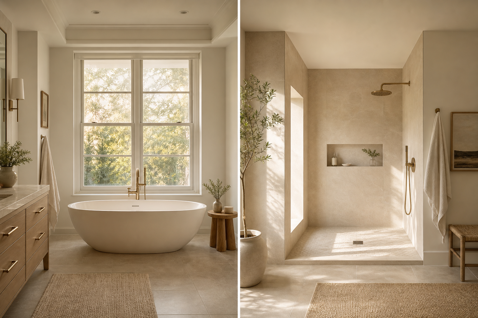
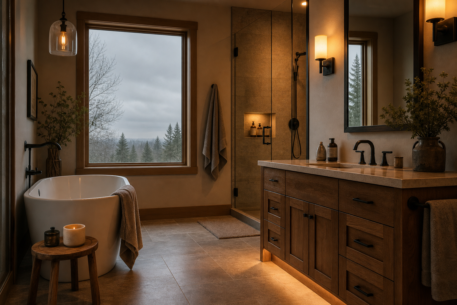
Blue-white light is the fastest route to clinical. Cool LED downlights at four thousand Kelvin or above render skin gray, make warm materials look muddy, and flatten the room into a uniform brightness that has no depth. The bathroom looks clean because nothing has shadow. It also has no warmth, no rest, and no invitation to linger.
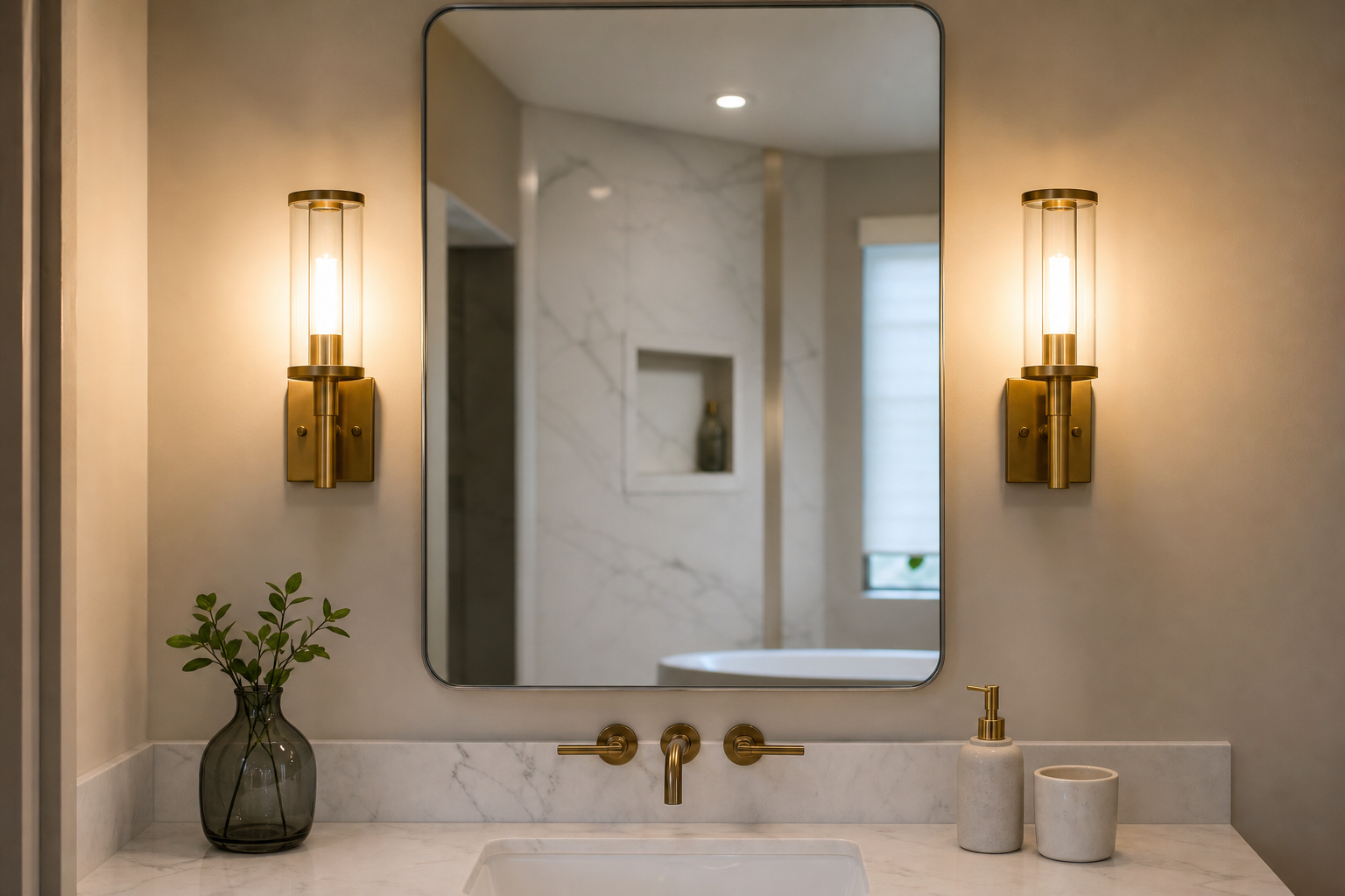
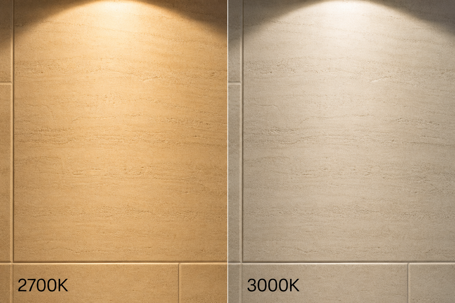
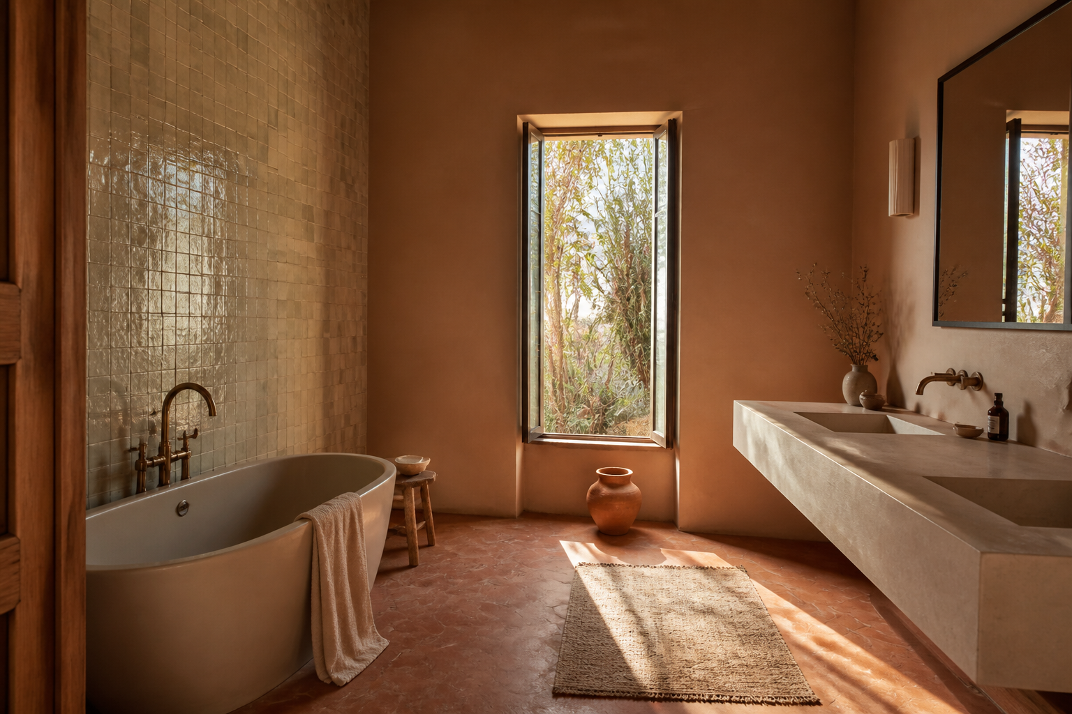
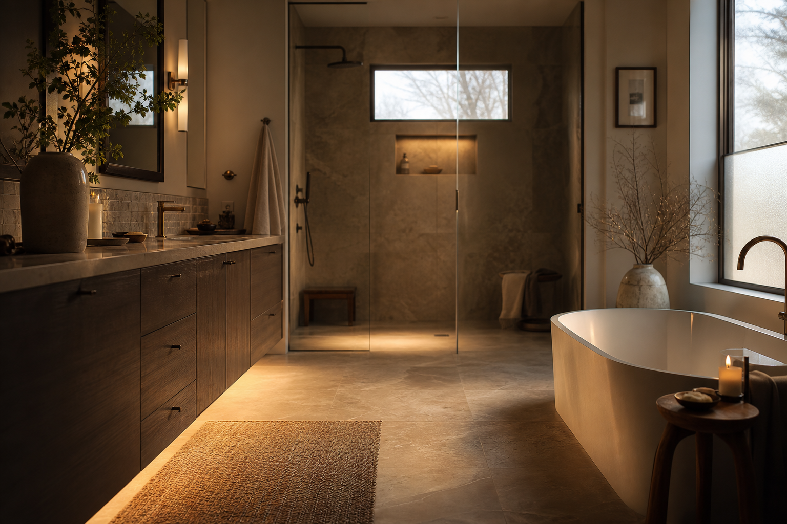
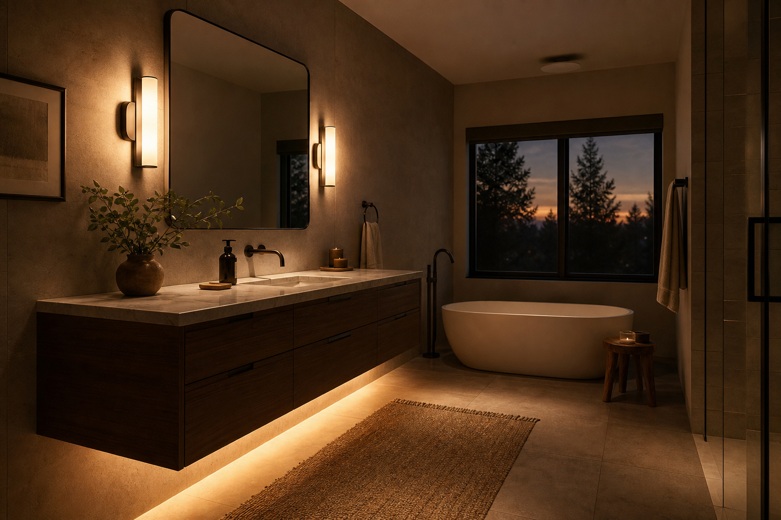
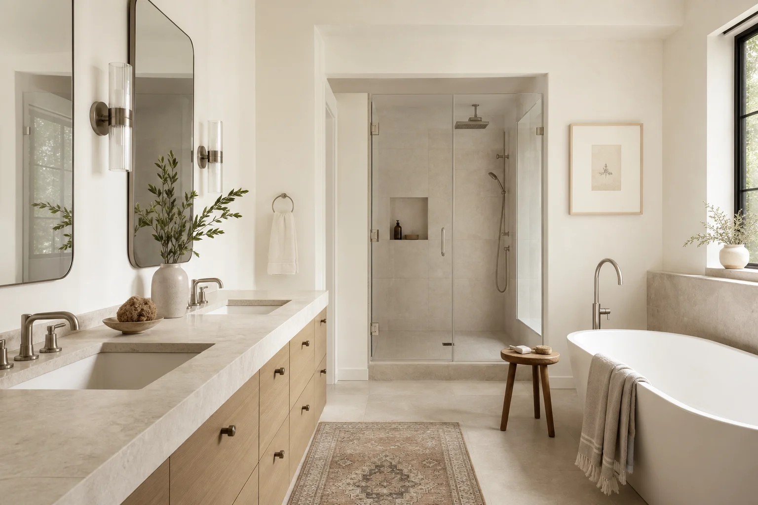
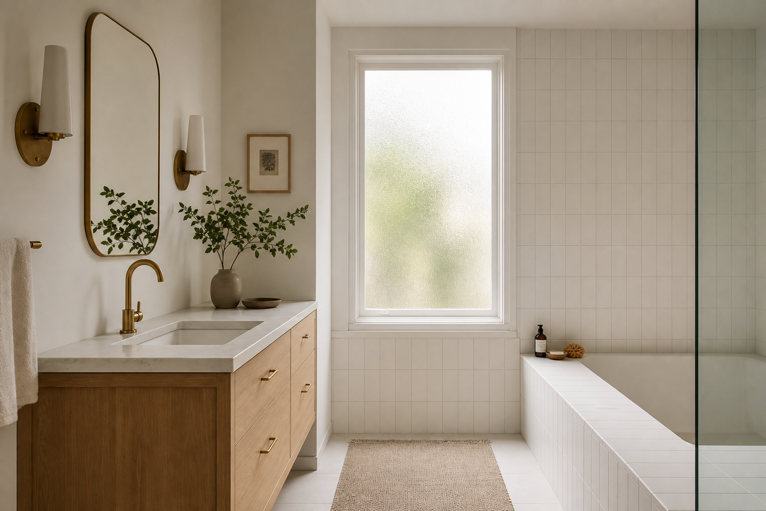
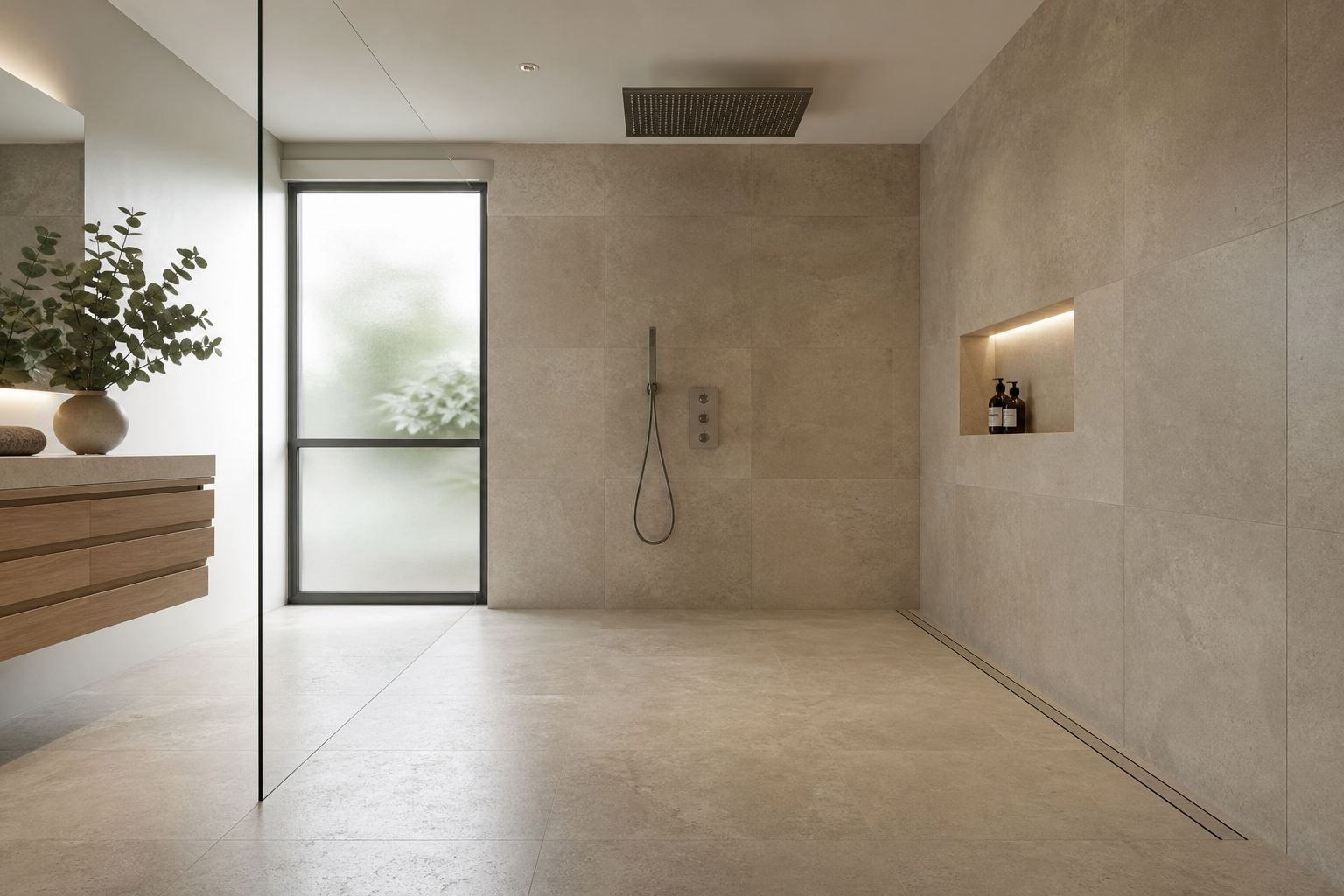
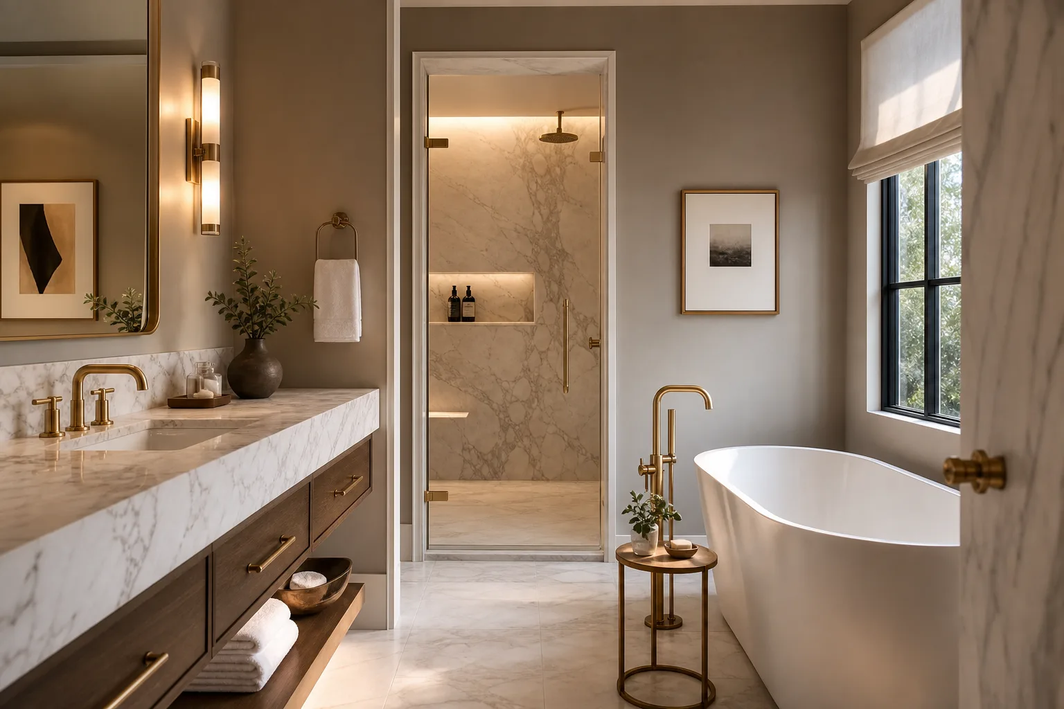
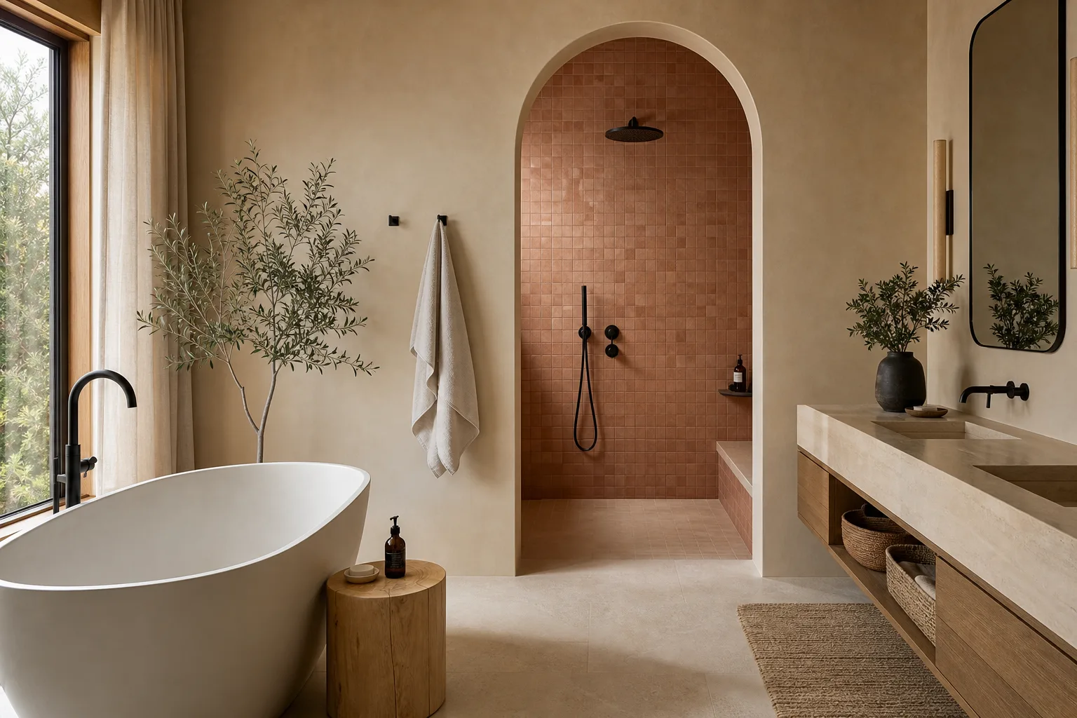
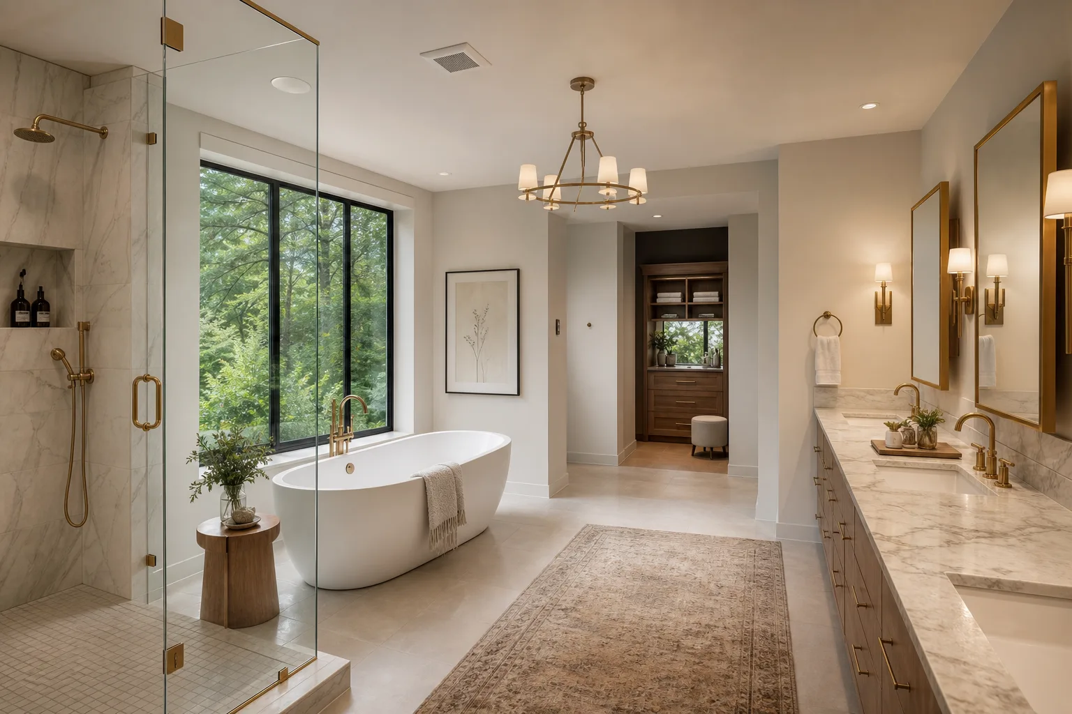
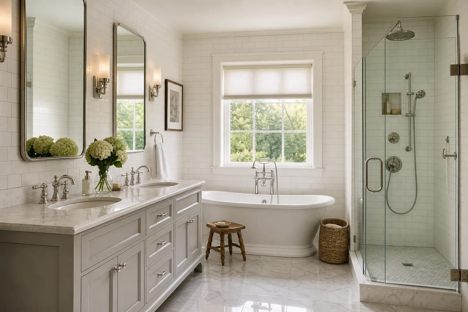
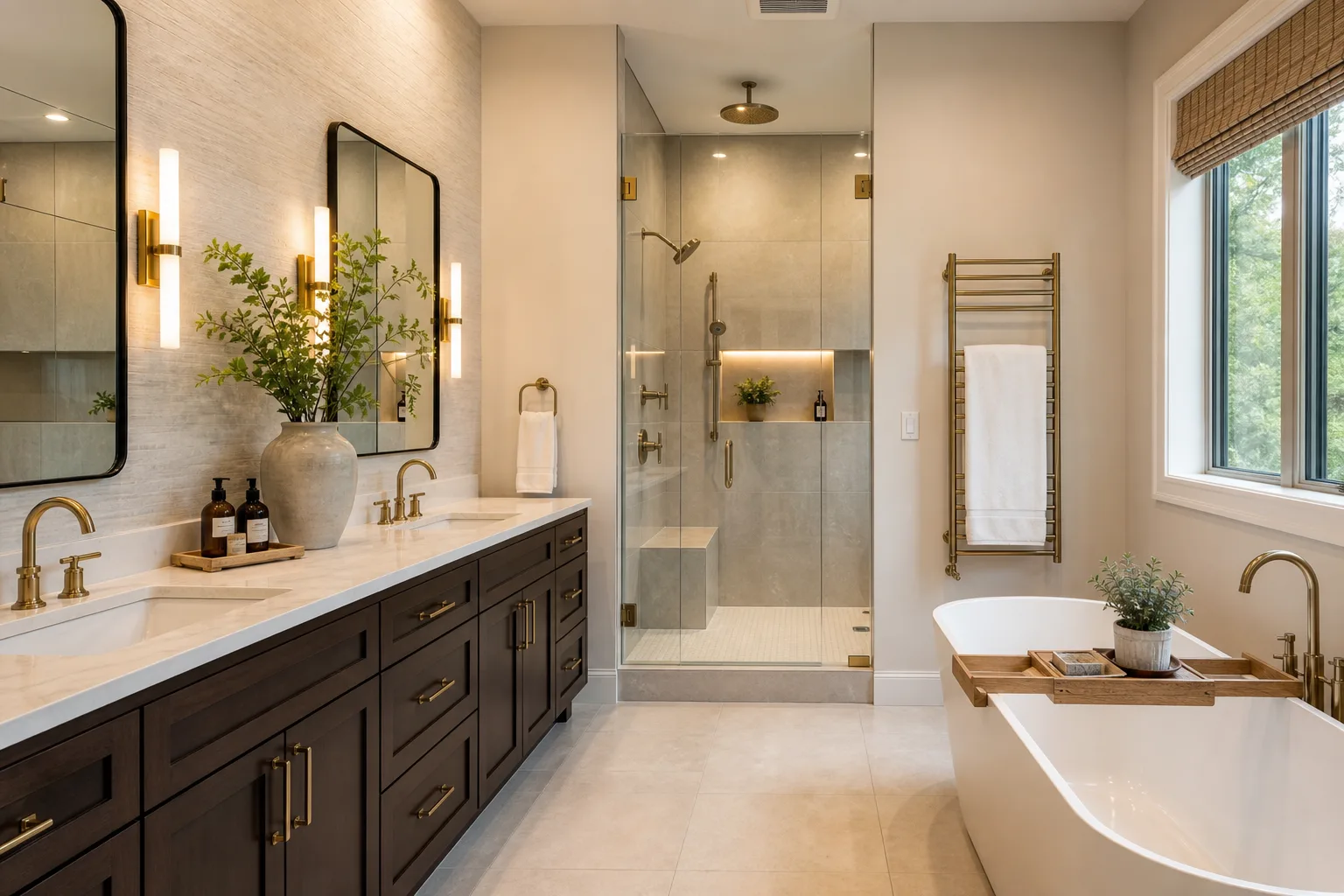
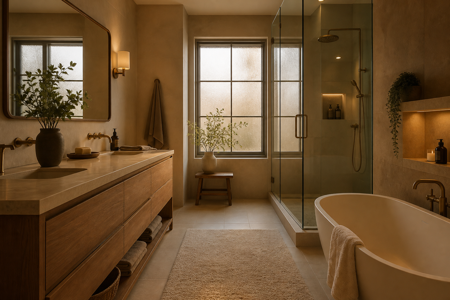
Jane Gorman Decorators, an Australian interior design firm specializing in residential bathrooms, describes this directly: cool white LED downlights produce light that is accurate and efficient and deeply unflattering to both the room and the people in it. The same downlight at twenty-seven hundred Kelvin reads softer, more golden, and more reminiscent of natural light at its most flattering. The fixture did not change. The temperature changed the entire room's emotional register.
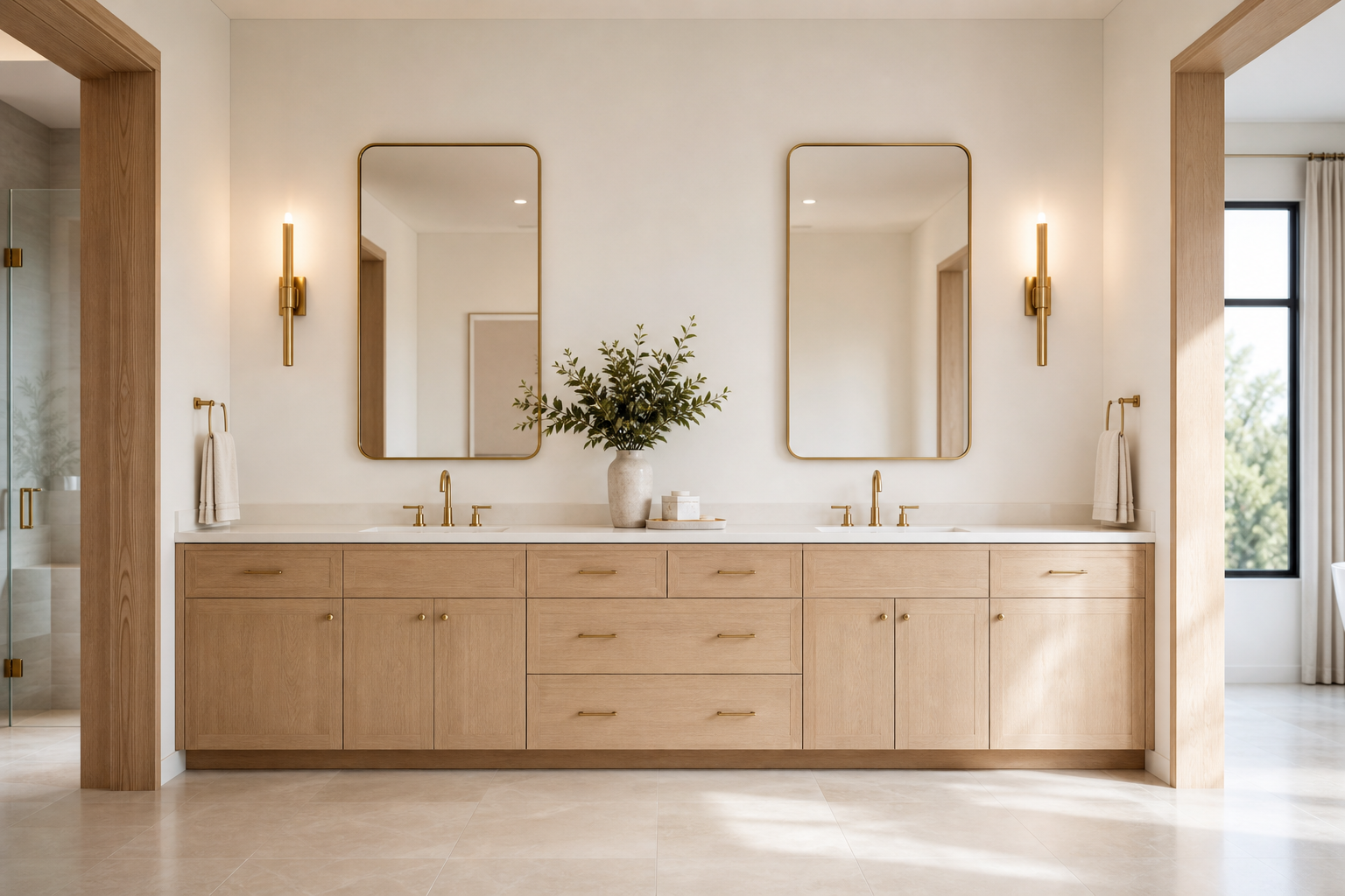
Calm requires warm light with accurate color rendering. Most residential guidance specifies twenty-seven hundred to three thousand Kelvin at the vanity with a Color Rendering Index of ninety or above. That range balances warmth with enough accuracy for grooming. It also allows materials with warm undertones to read as intended rather than fighting the light source.
Layering matters as much as temperature. A single overhead grid of recessed cans produces flat, shadowless illumination that reads institutional. Calm bathrooms use at least two layers: ambient light for general navigation and task light at the mirror for the face. A third layer, low and warm, at the tub or in a corner, adds depth without brightness. The room has zones rather than a uniform wash.
Dimming is not optional for calm. A bathroom that is fully bright at eleven p.m. triggers alertness. The same bathroom dimmed to twenty percent at the same hour triggers rest. Calm is partly a function of being able to change the room's intensity to match the hour and the activity.
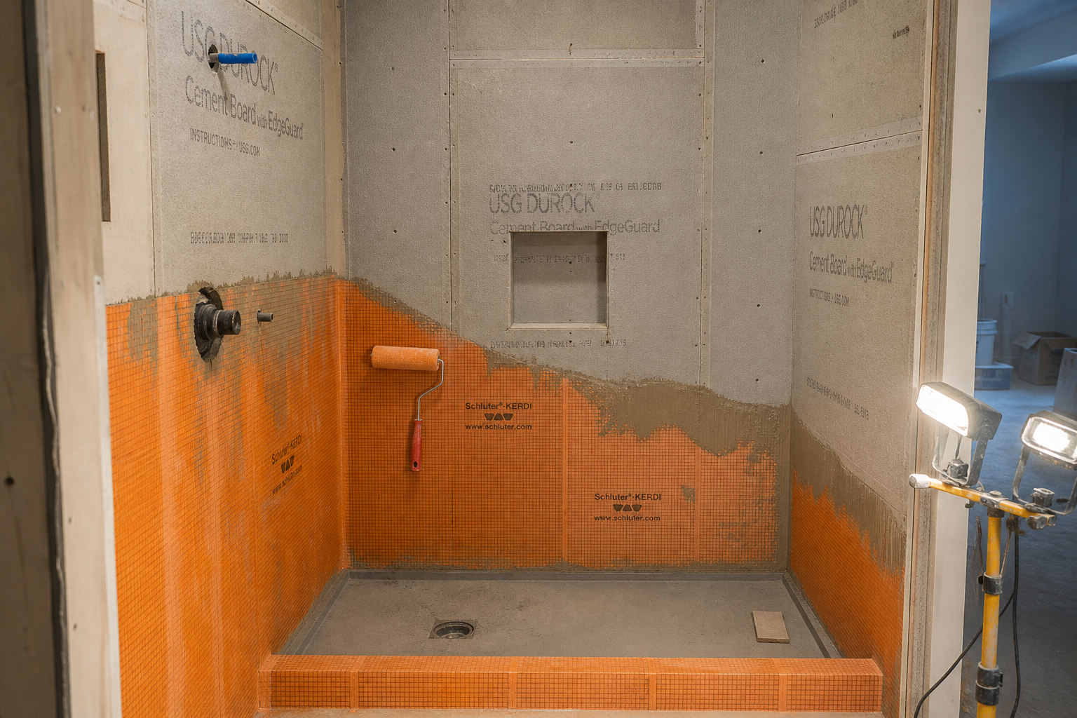
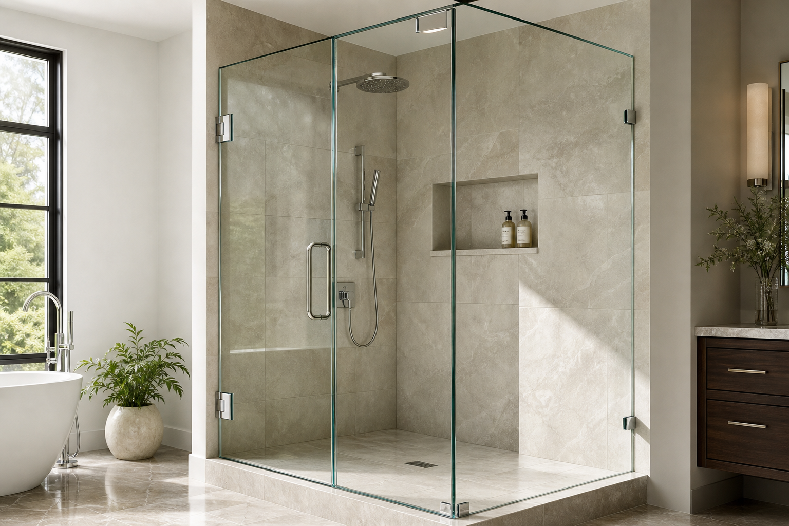
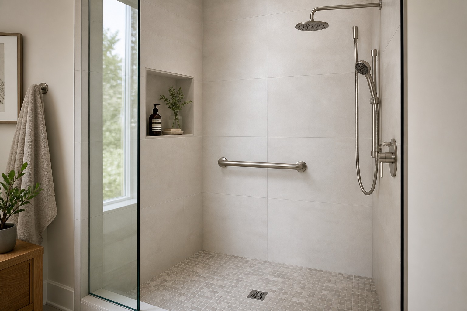
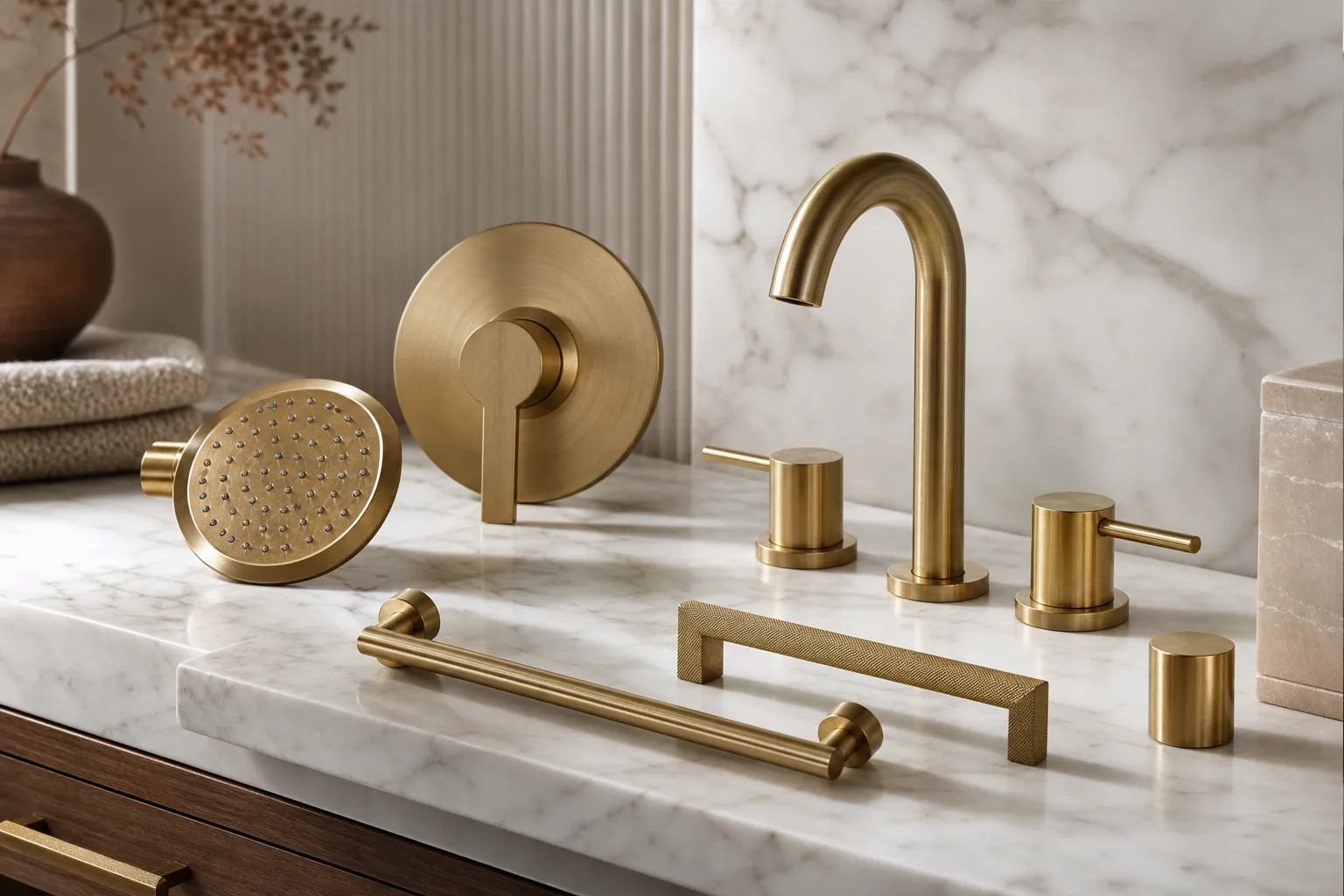
Variable Two: Visual Weight in Materials
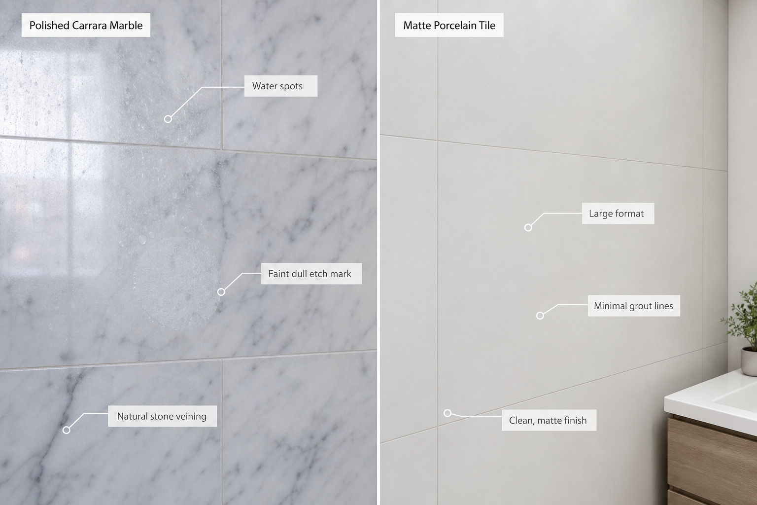
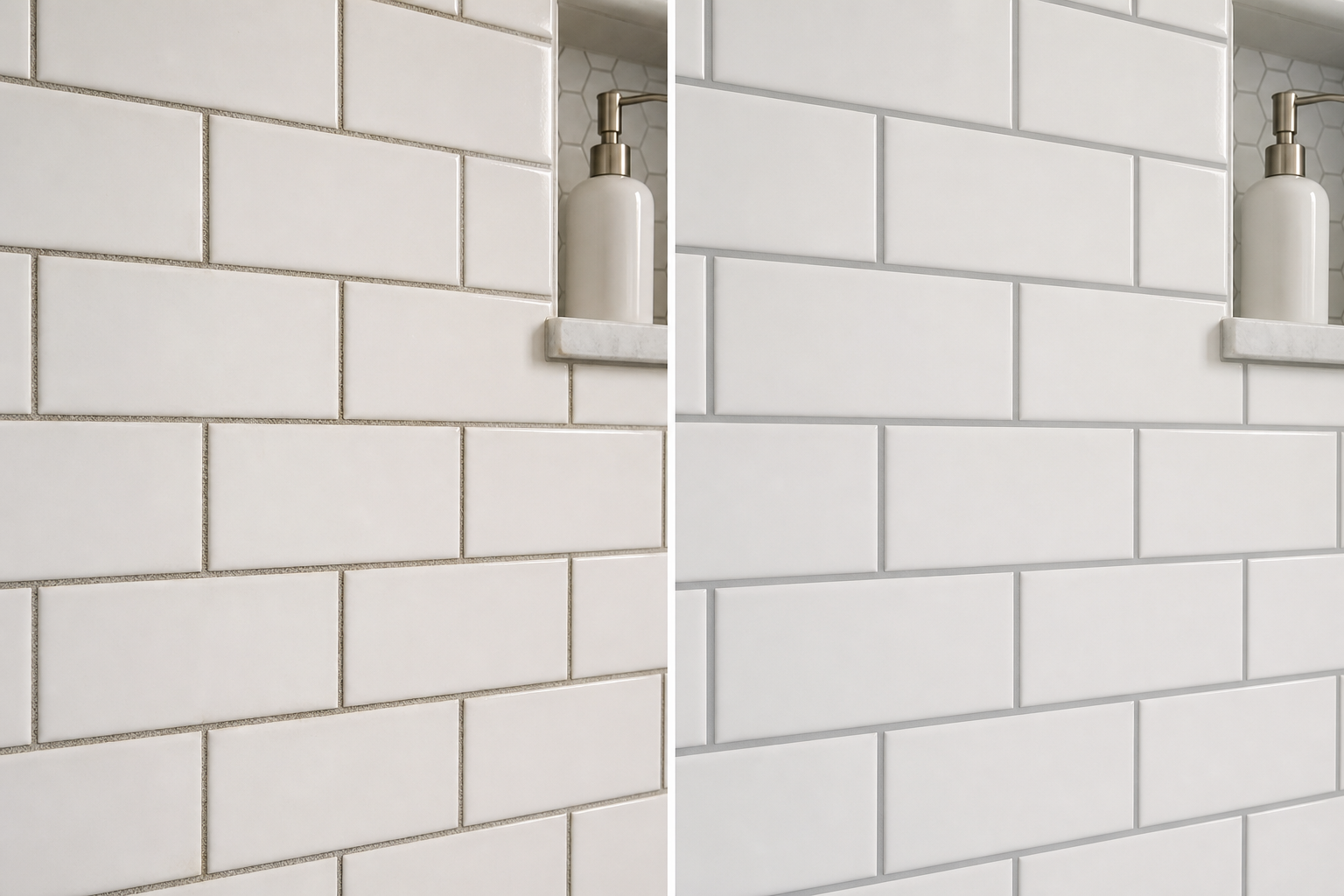
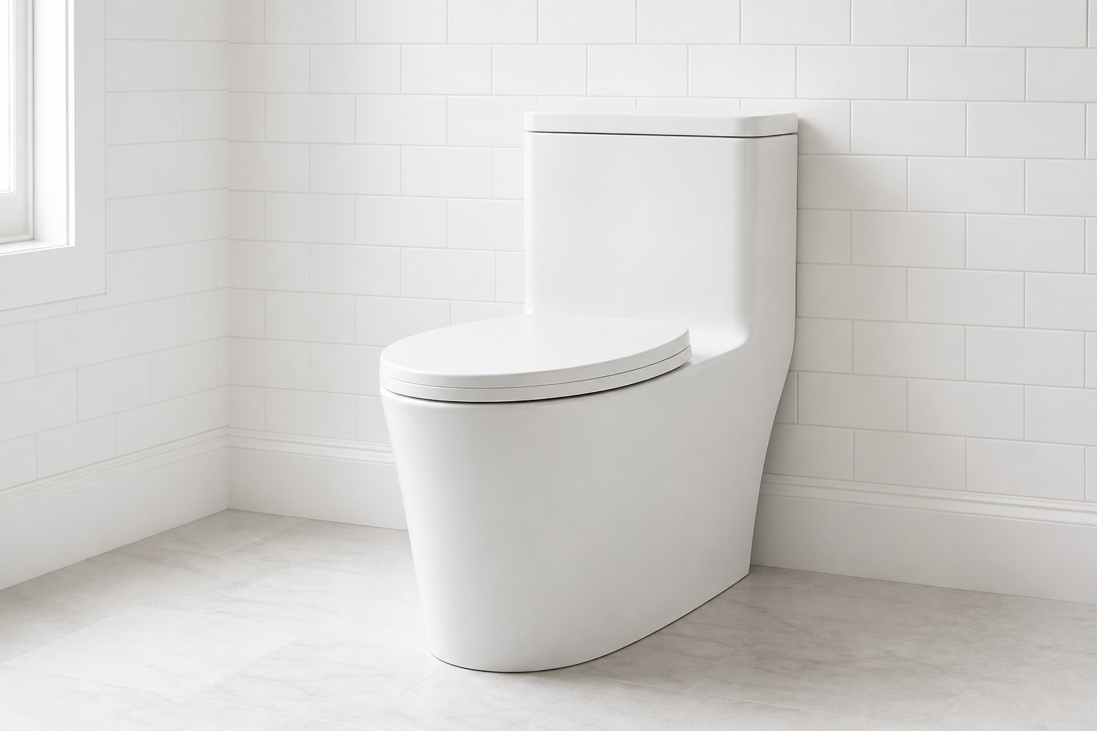
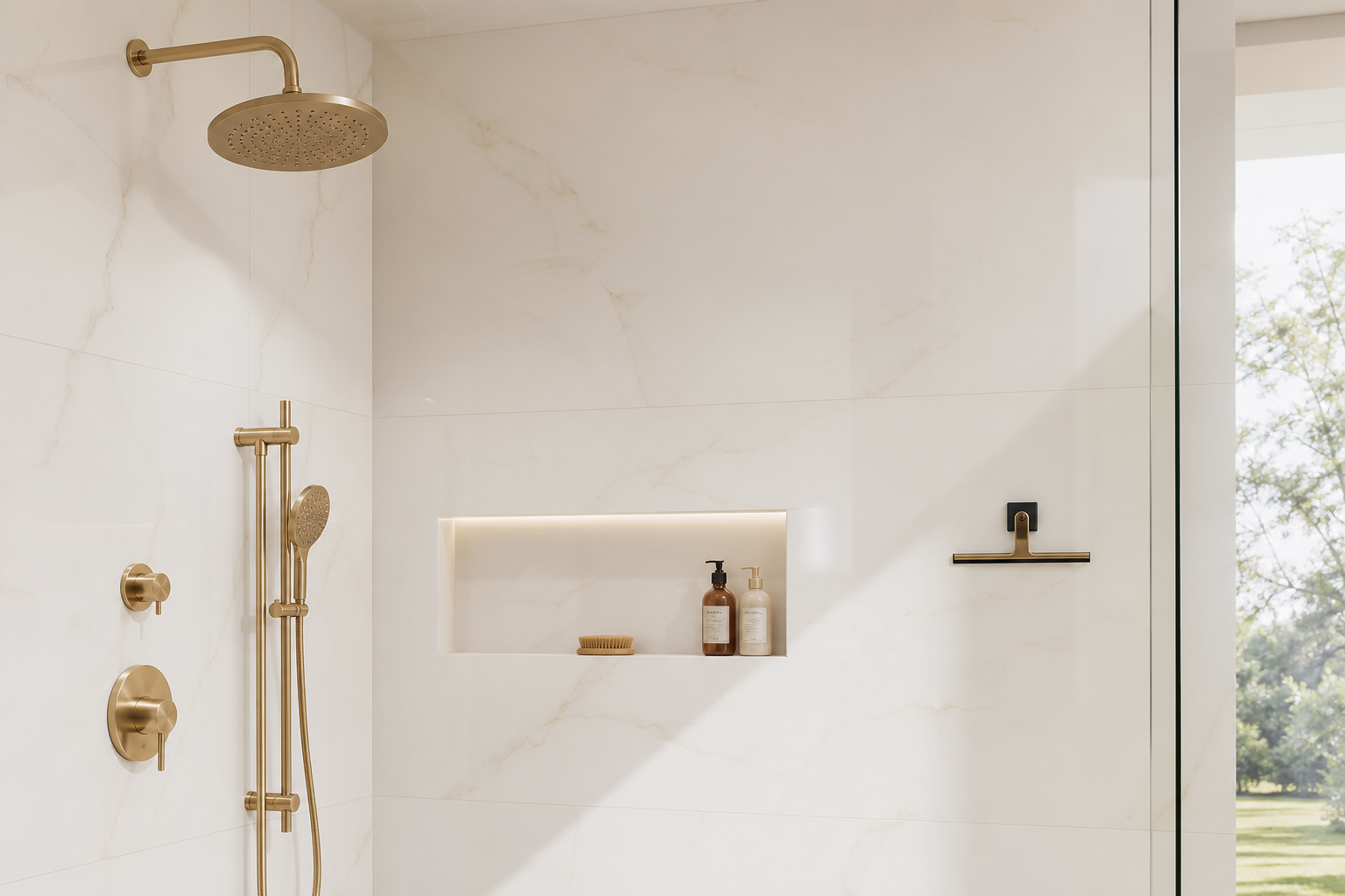
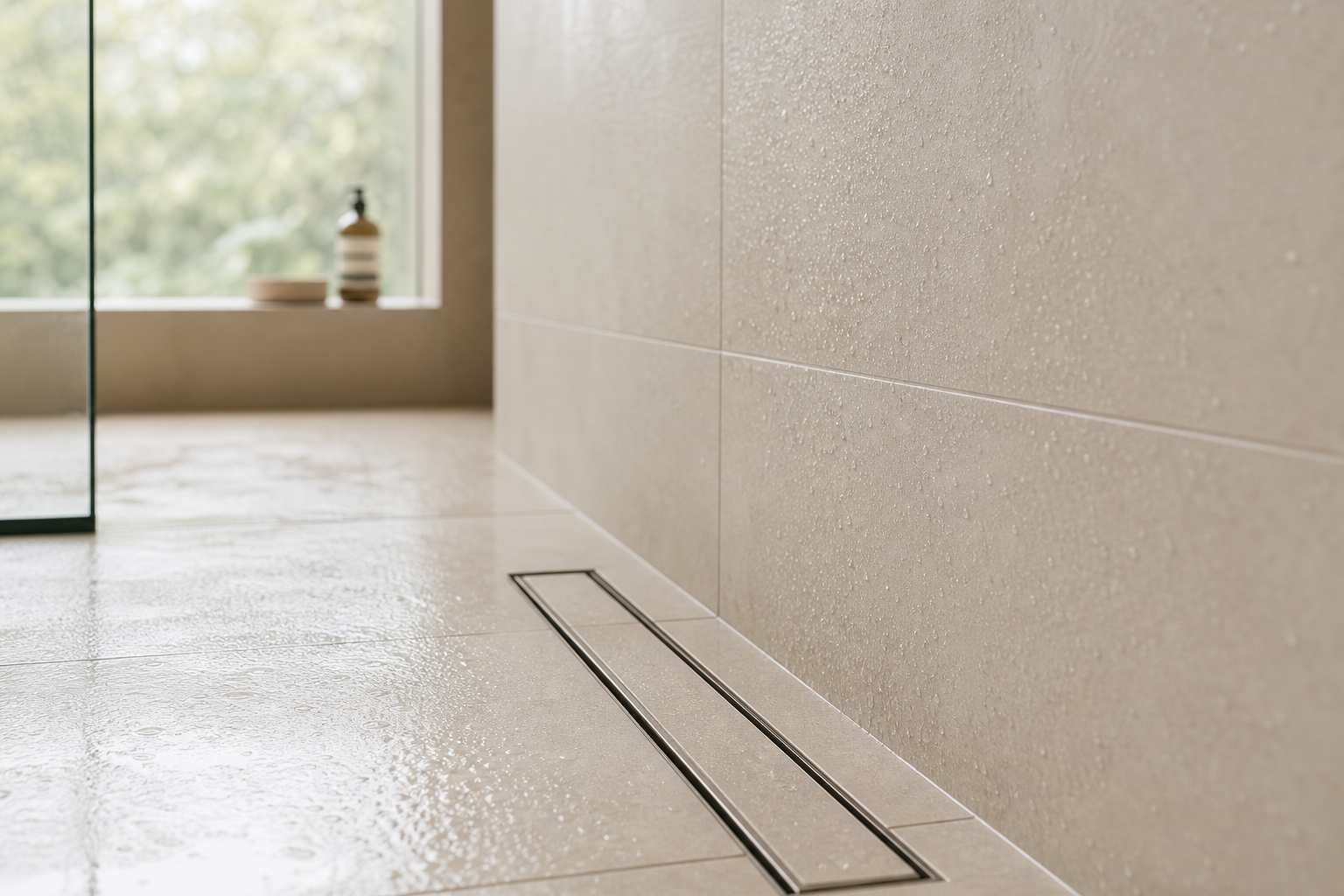
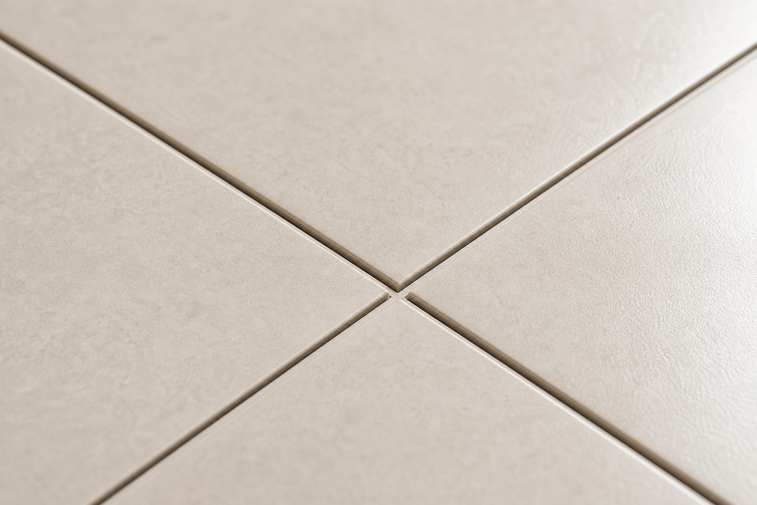
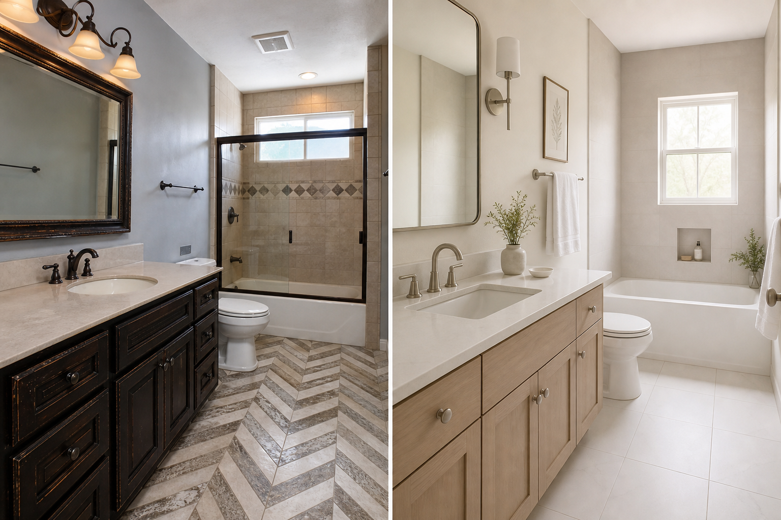
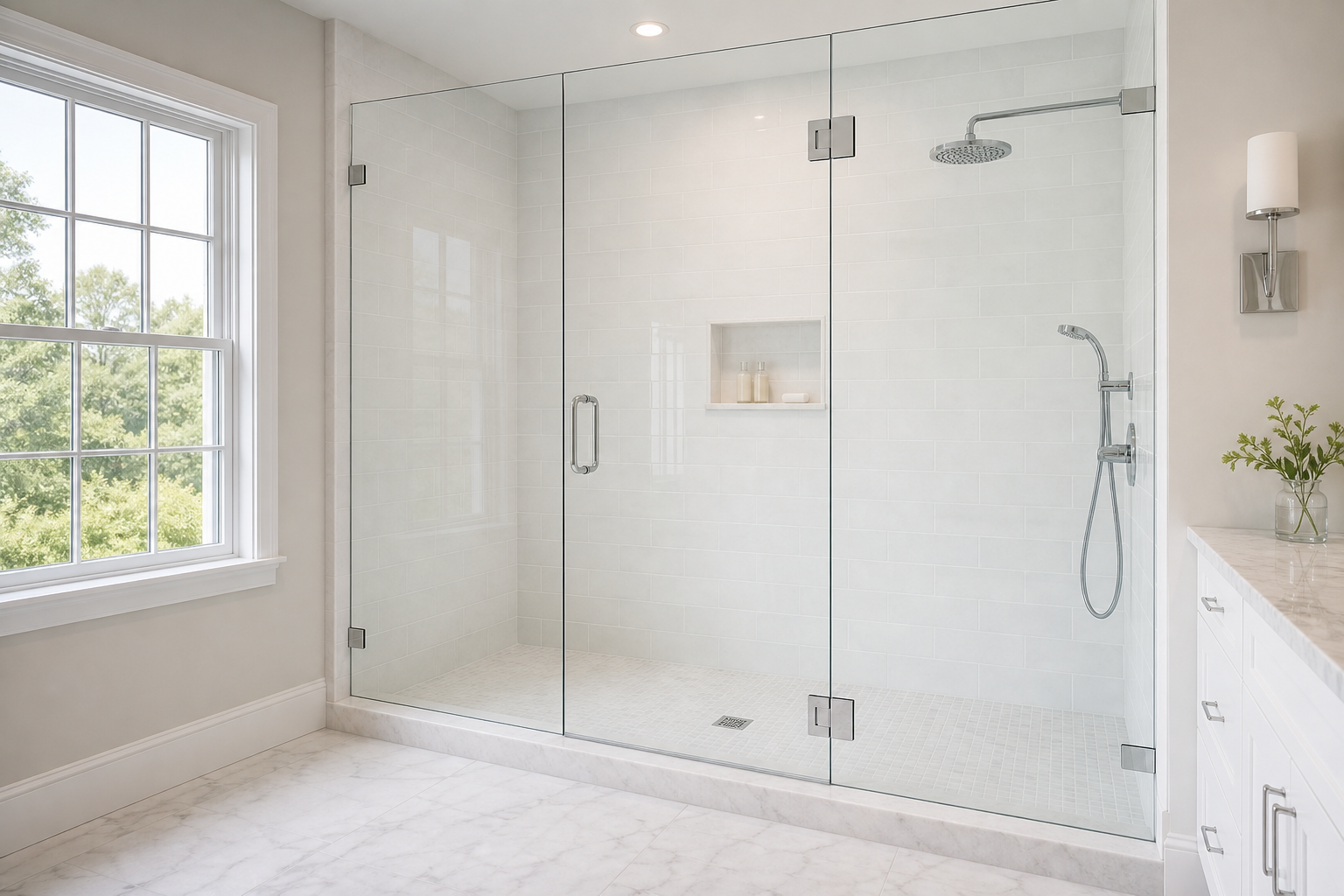
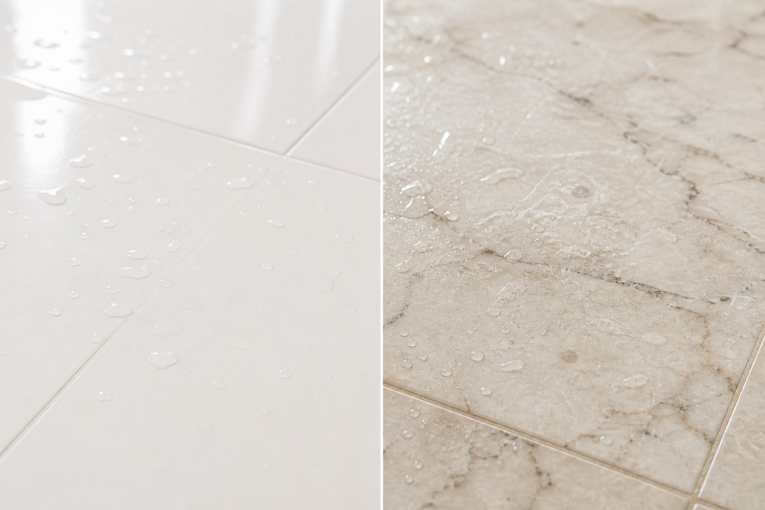
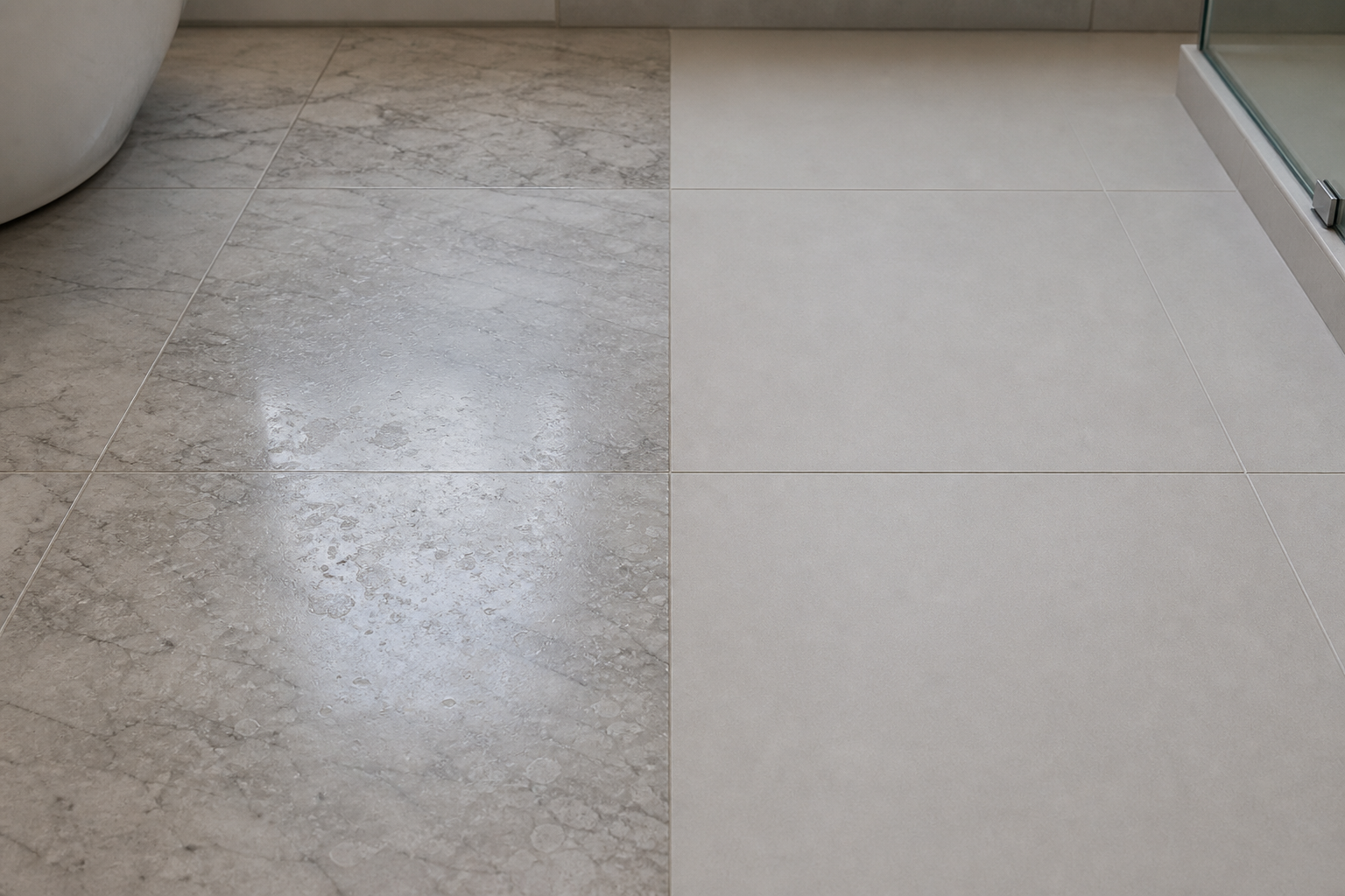
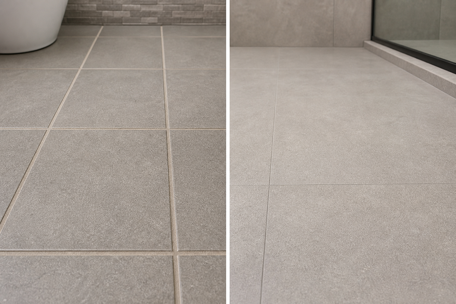
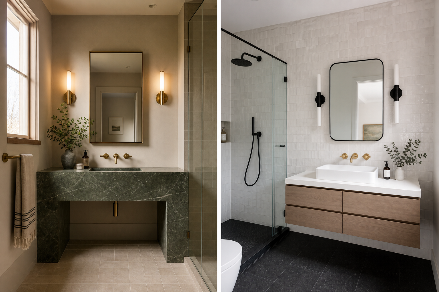
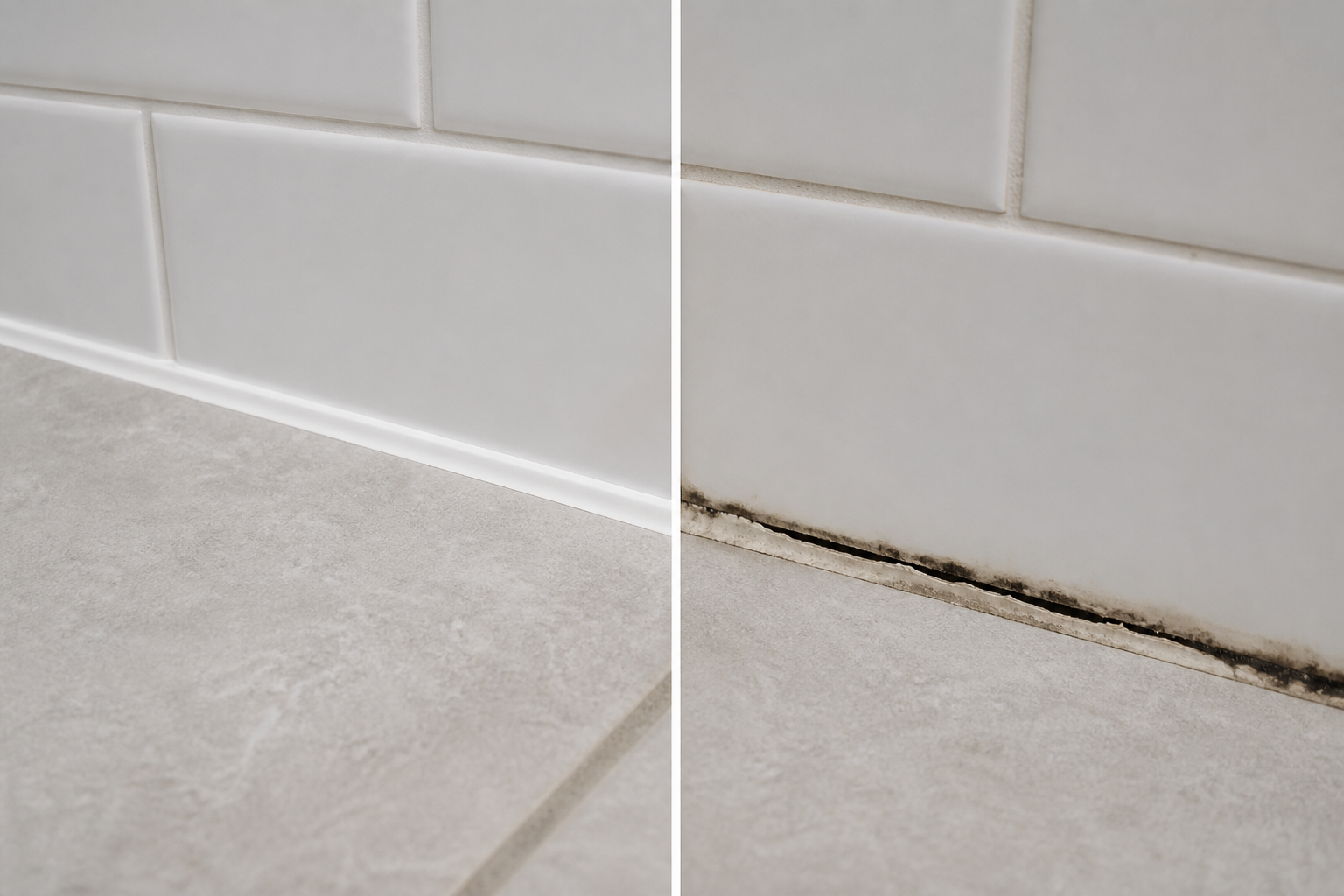
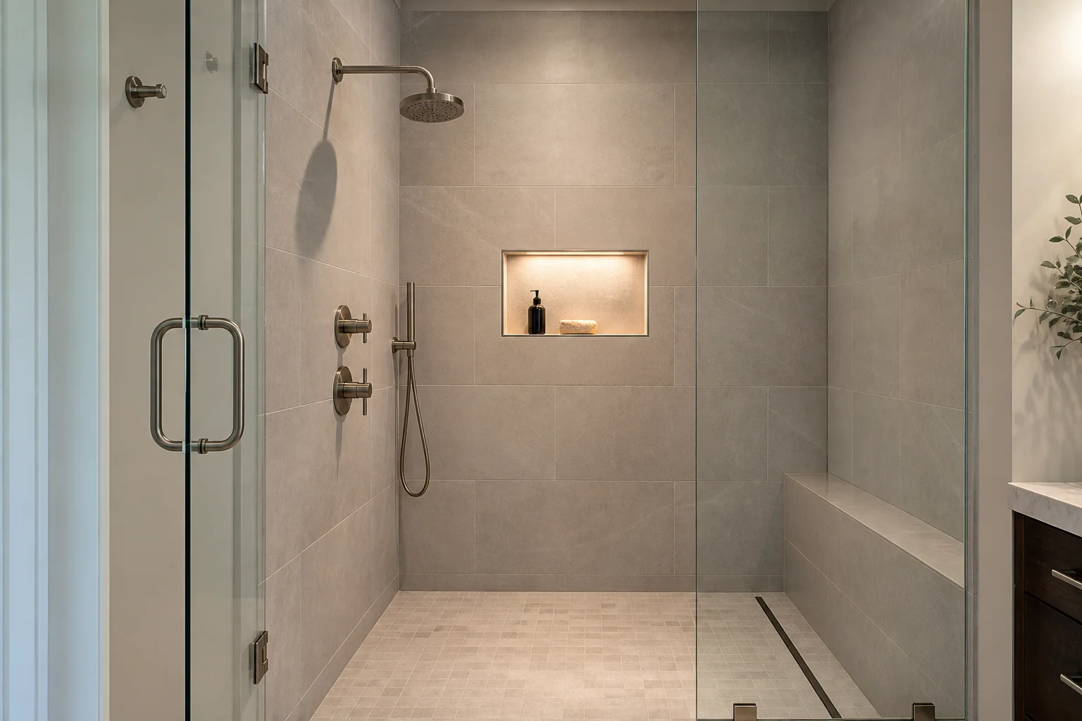
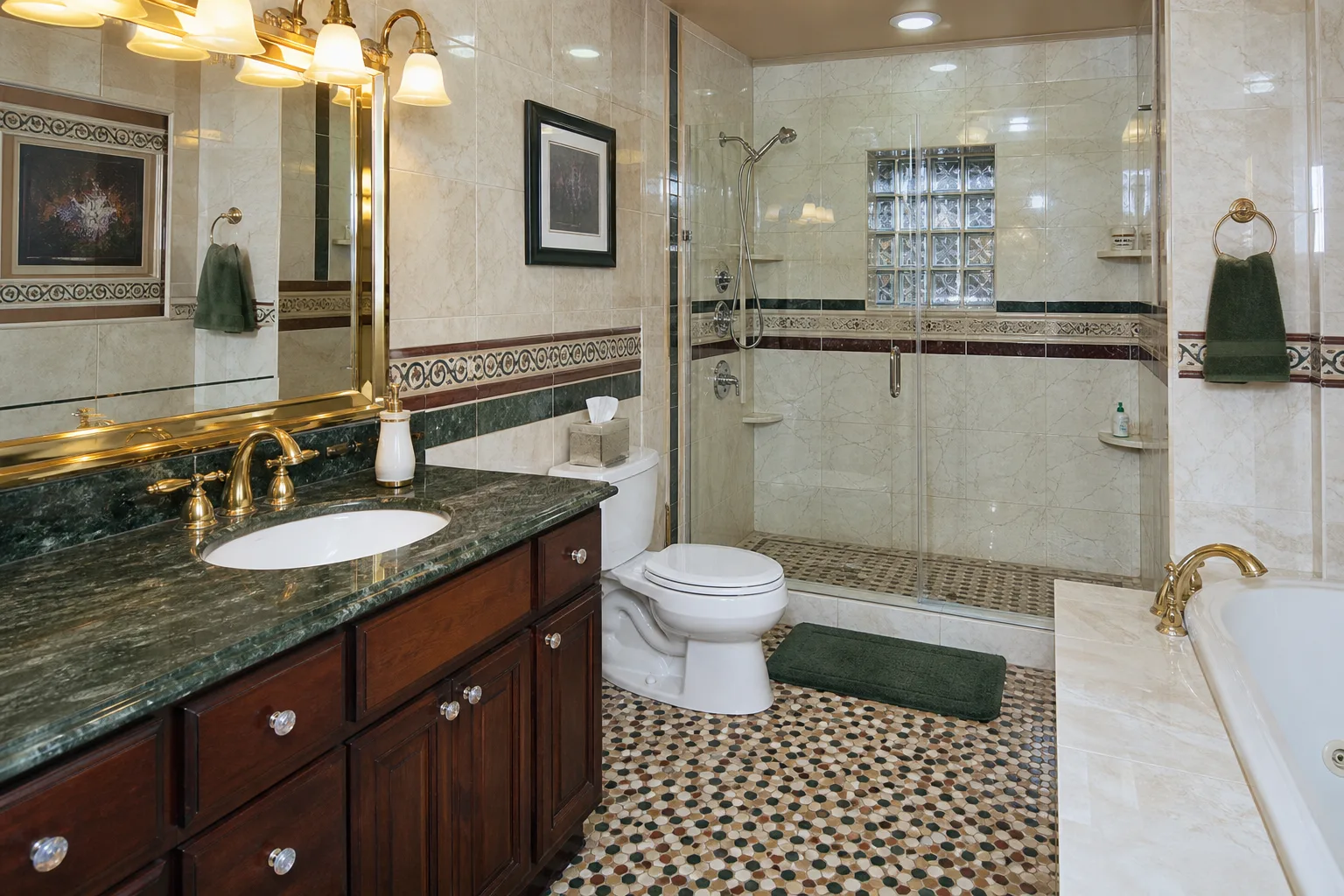
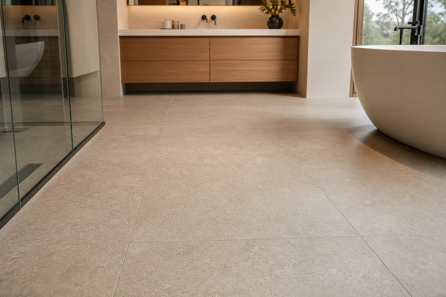
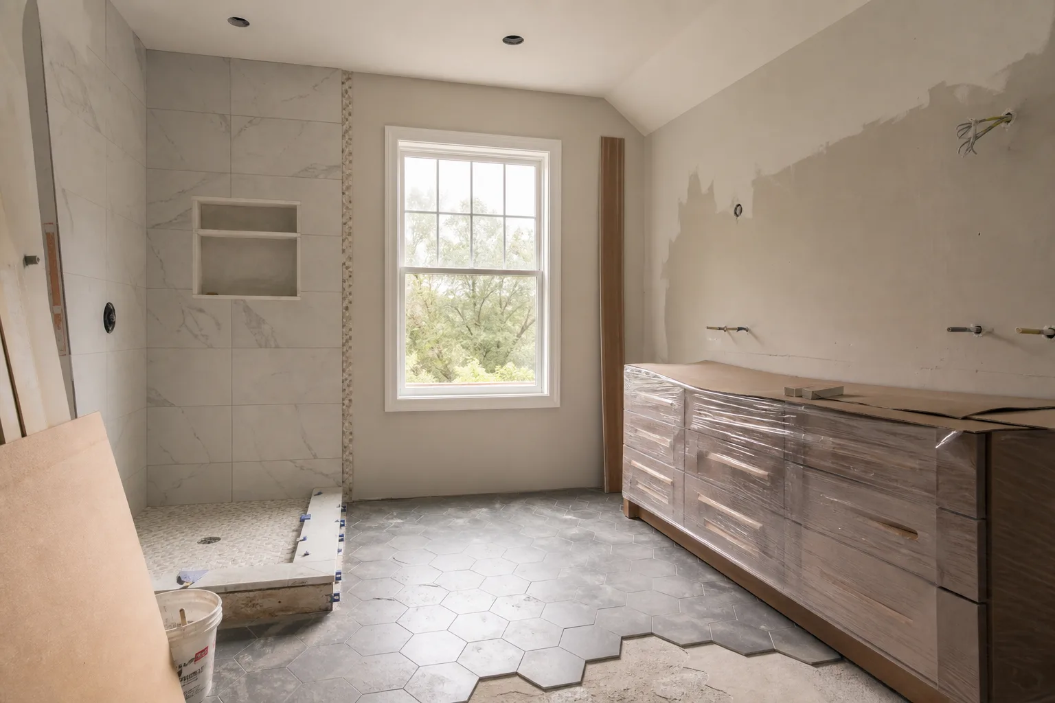
Materials with no visual weight make a bathroom feel temporary, like a rental or a medical facility. High-gloss white tile, frameless glass, polished chrome, and flat painted walls reflect light without absorbing it. The room is bright but empty. Nothing anchors the eye. Nothing holds the space.
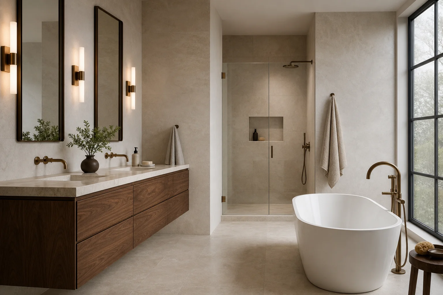
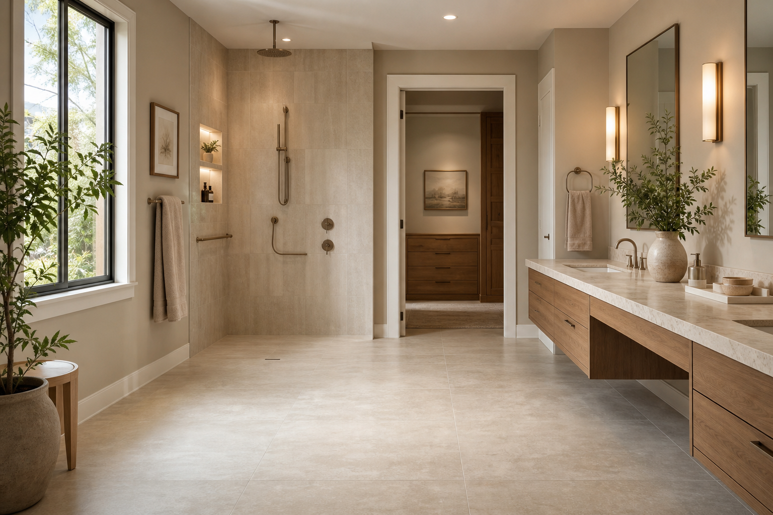
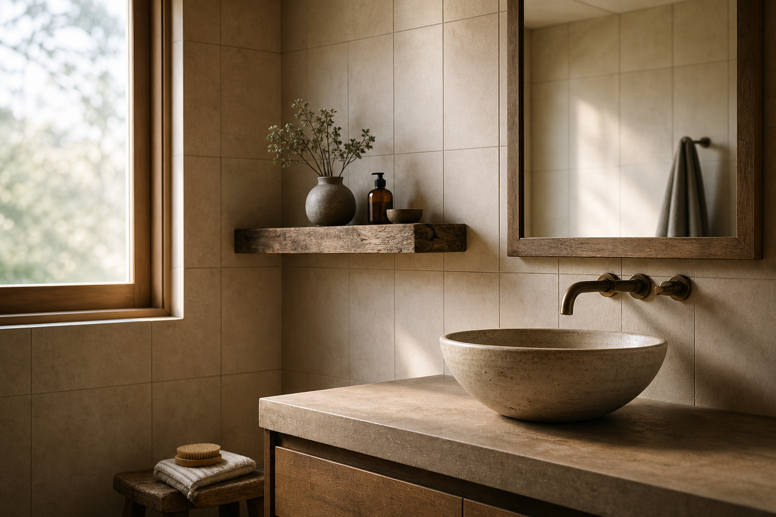
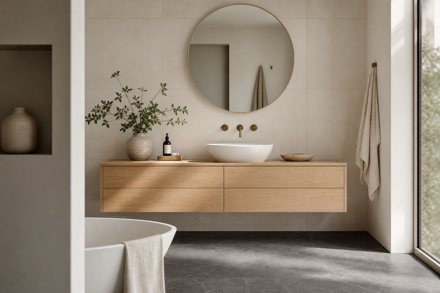
Visual weight is the perceived density and presence of a material. Limestone has visual weight. Matte porcelain with texture has visual weight. Walnut vanity cabinetry has visual weight. Polished white subway tile on every surface has almost none. The clinical bathroom is often a room where every material was chosen for reflectivity and cleanability without considering how those surfaces accumulate into a sensory experience.
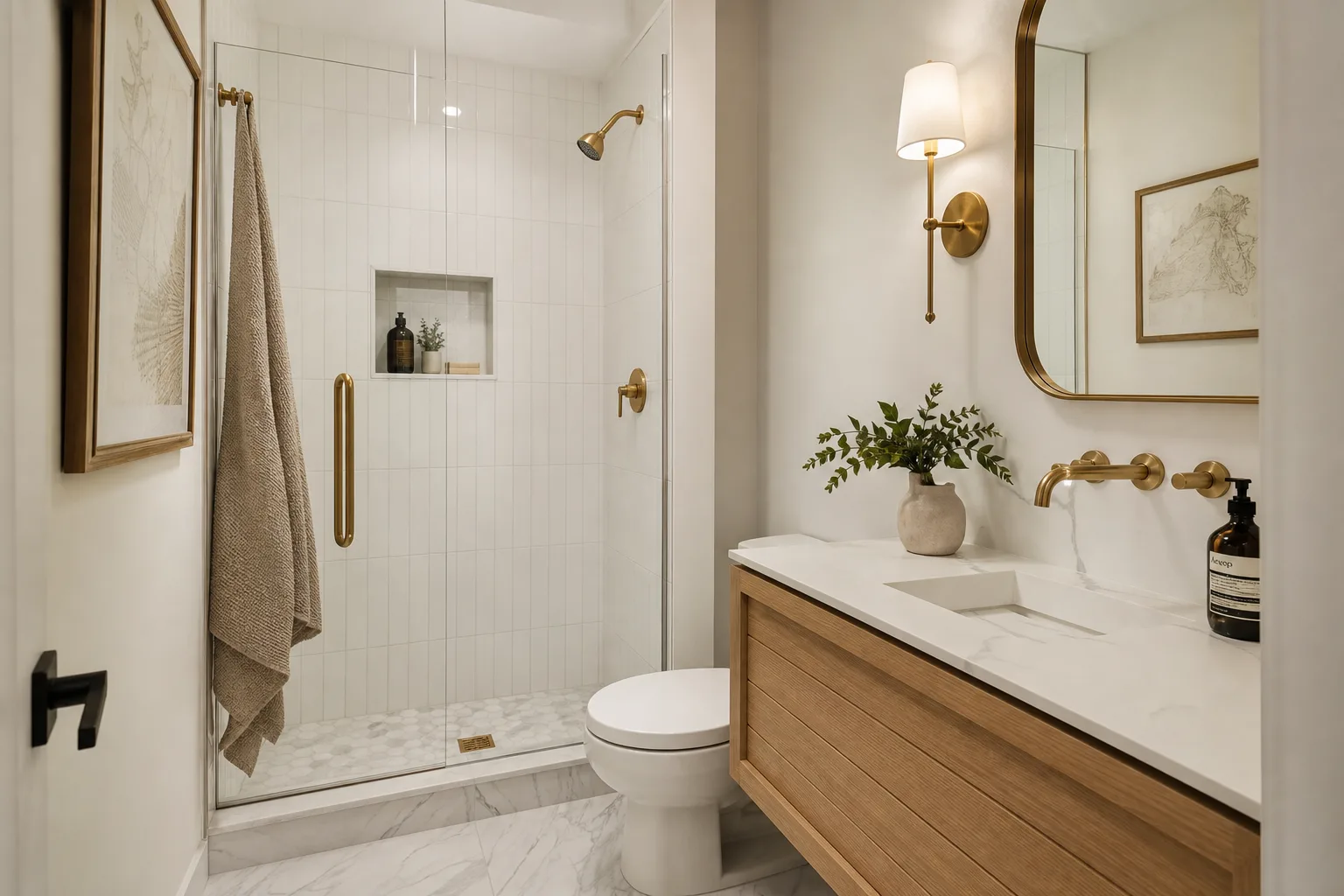
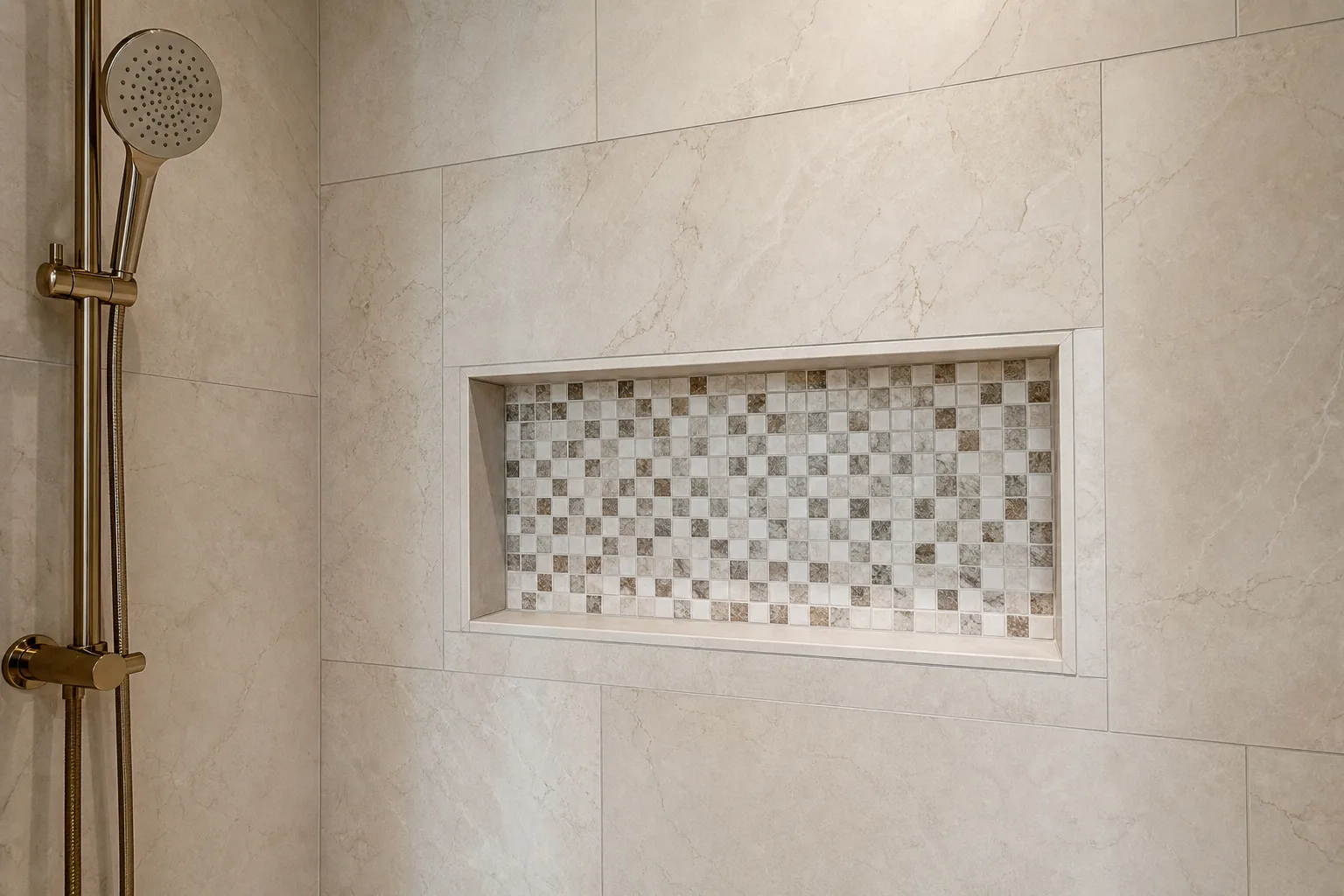
The Property Daily, reporting on 2026 bathroom design trends, notes the shift away from the "white box": high-gloss white tiles, chrome taps, and bright clinical lighting are being replaced by textured slate, warm travertine-effect porcelain, and matte finishes that feel soft to the touch. Matte and textured surfaces absorb light rather than reflecting it, creating a softer, more intimate atmosphere. The change is not aesthetic preference. It is a material property that affects how the room feels to stand in.
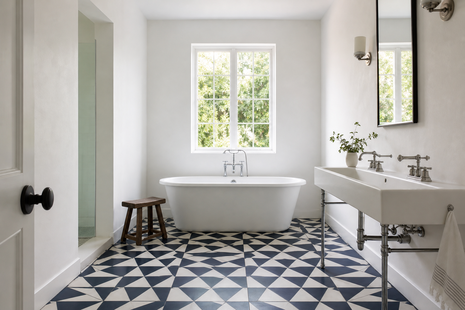
Calm does not require dark materials. It requires materials with enough body to register as present. Warm white tile with a matte finish has visual weight. Cool white tile with a high gloss does not. The difference is subtle in a sample board and obvious at six a.m. when you are standing barefoot on the floor.
Material hierarchy supports calm. When one material leads and others support it, the room has structure. When every surface competes at equal volume, the room feels restless even if the palette is neutral. Calm is partly the result of knowing which material is in charge.
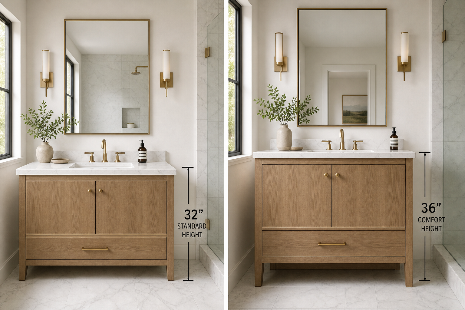
Variable Three: Proportion and the Human Body
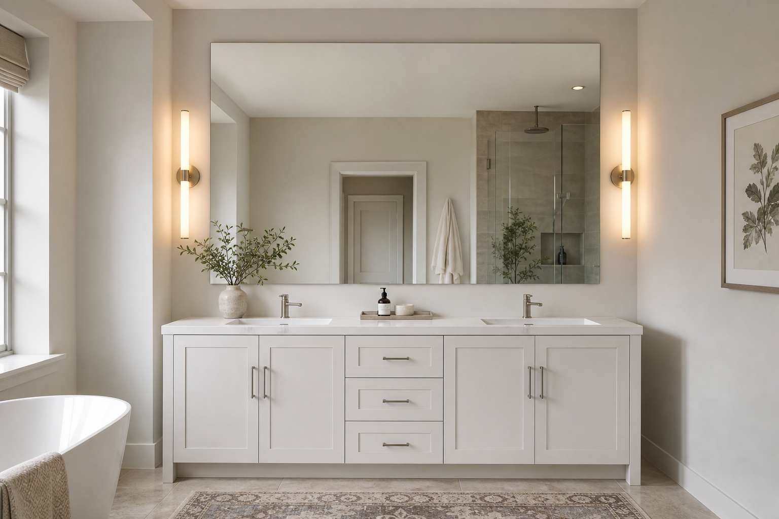
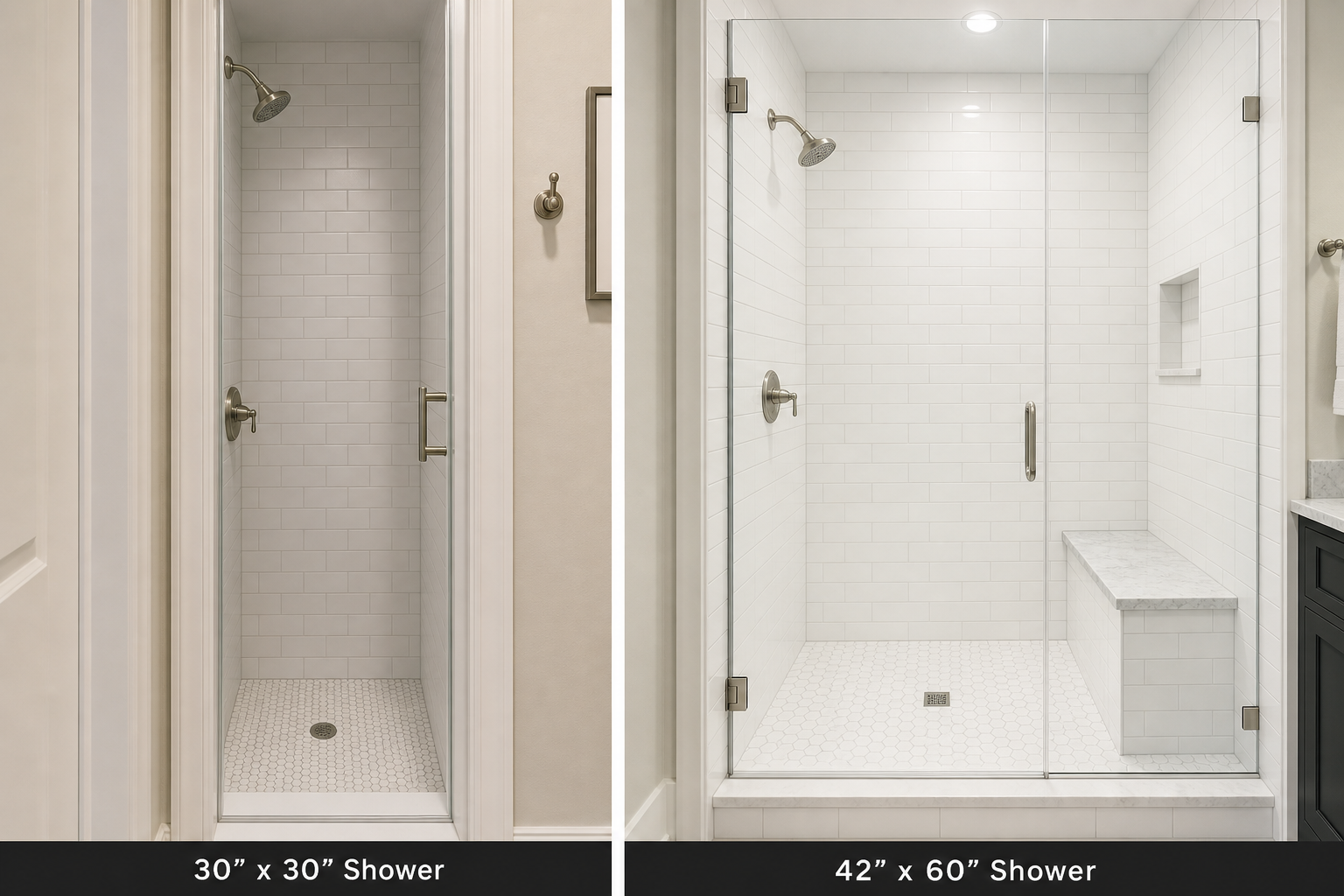
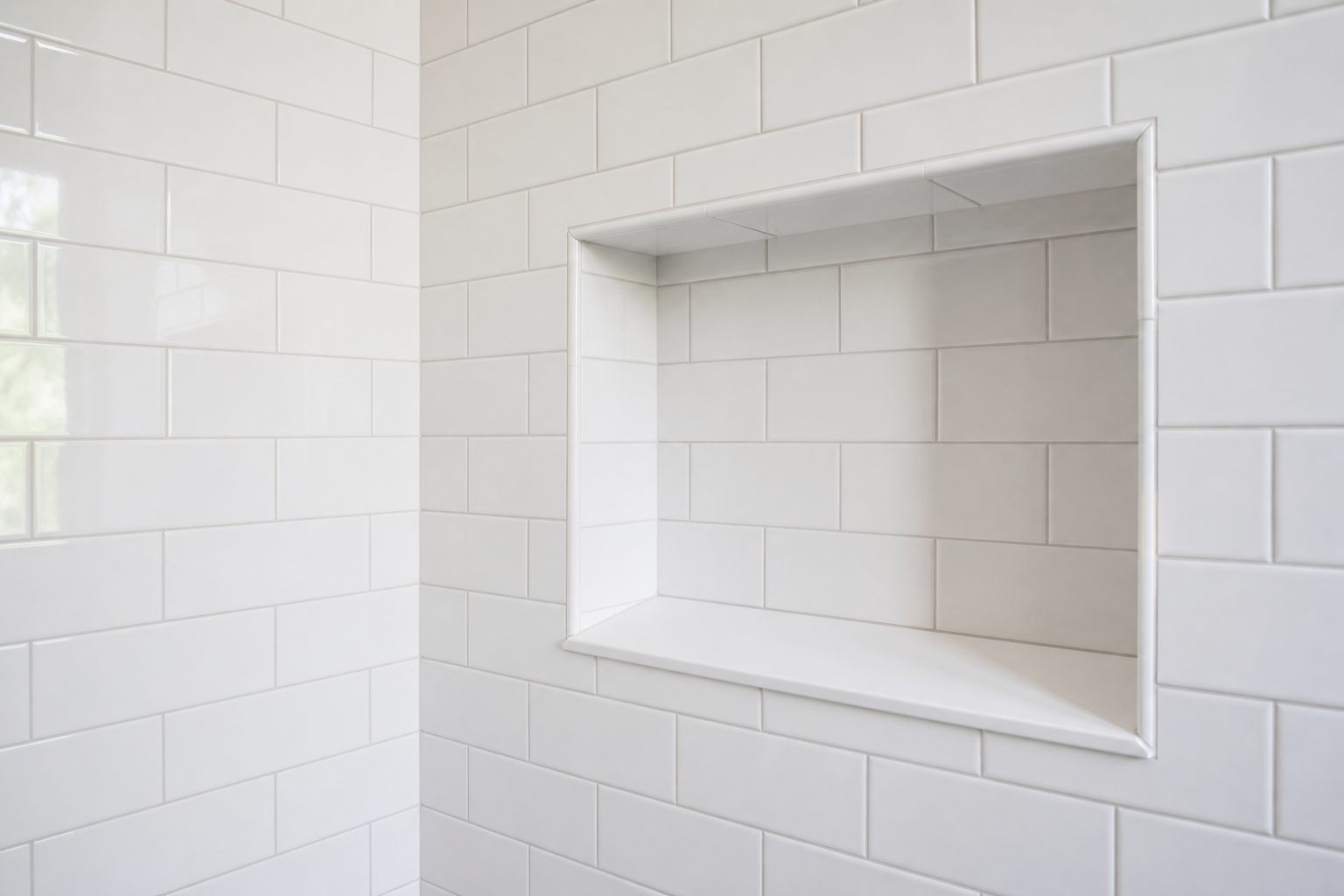
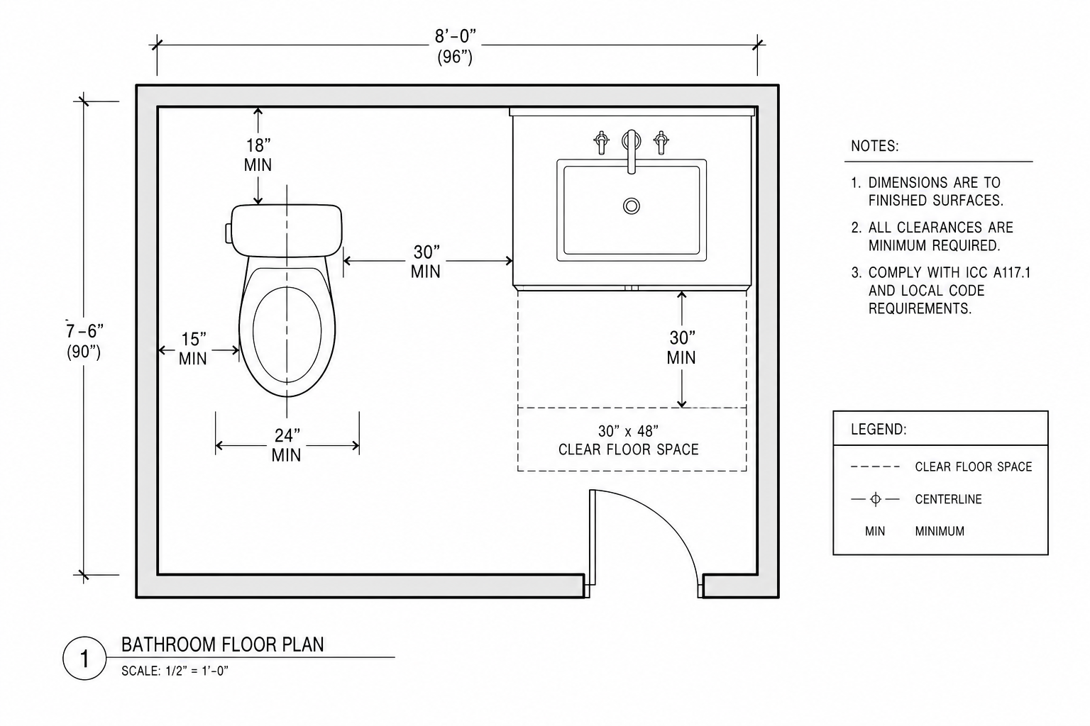
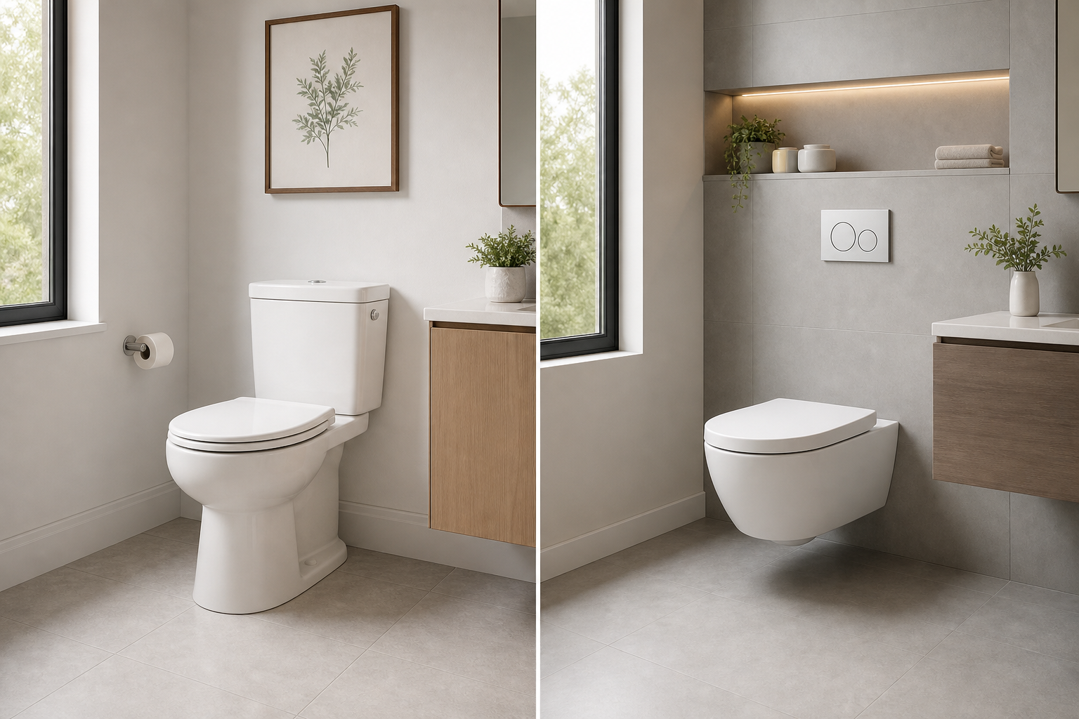
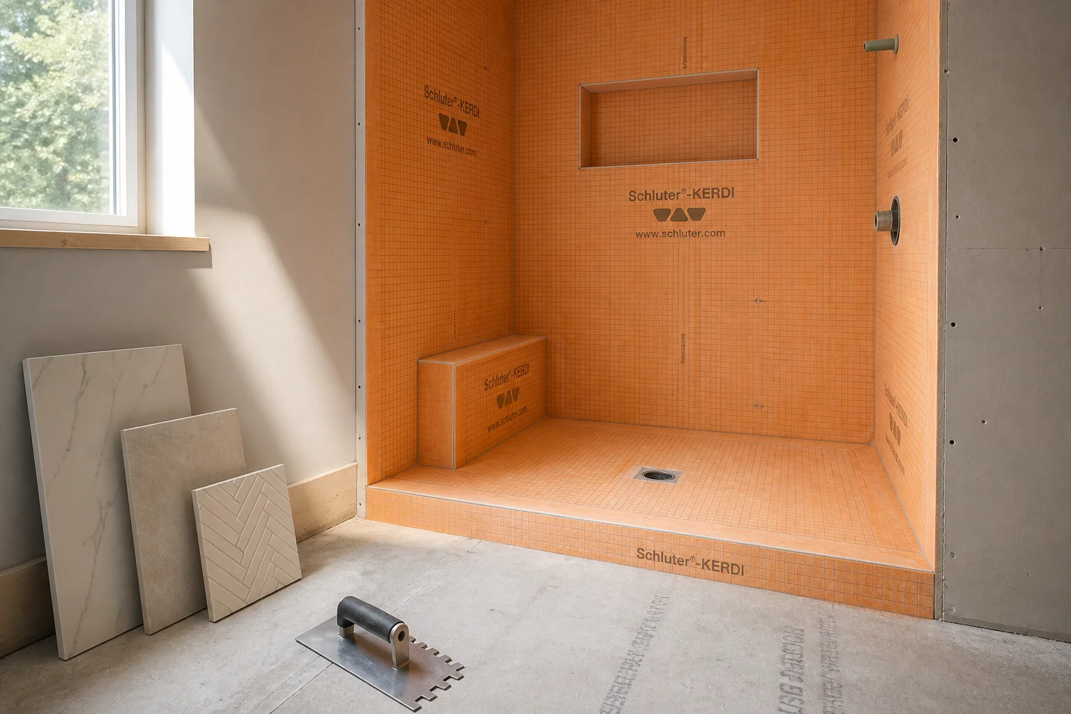
A bathroom that does not relate to the human body feels like a service space. The vanity is too high and your reflection cuts off at the chest. The mirror is too small and you lean forward to see your face. The shower head is placed for a person six inches taller than you. The toilet is squeezed into a alcove with no knee room. Each proportion error is small. Together they produce a room that serves the drawing, not the person.
Proportions in calm bathrooms are measured from use, not from symmetry. Vanity height is set to the elbow height of the primary user, typically thirty-four to thirty-six inches for most adults. Mirror height spans from eye level to a few inches above the head, not from countertop to ceiling for visual drama. Shower controls are placed where the standing user can reach them without bending or stretching. Towel bars sit where a wet hand can grab them without dripping across the floor.
The NKBA and most ergonomic bathroom guidance base clearances on adult body dimensions: thirty inches minimum for shower width at code, thirty-six inches recommended for comfort, forty-eight to fifty-four inches of clear floor space in front of fixtures. These numbers exist because bodies have fixed dimensions. A room that ignores them feels wrong even when you cannot name why.
Scale errors produce clinical feeling because they signal that the room was designed for display rather than occupation. A vanity sized for a showroom photograph rather than two people getting ready produces morning friction. A shower niche placed for tile symmetry rather than hand height produces daily annoyance. Calm requires that fixtures and built elements answer to the body first and the camera second.
Variable Four: Acoustics
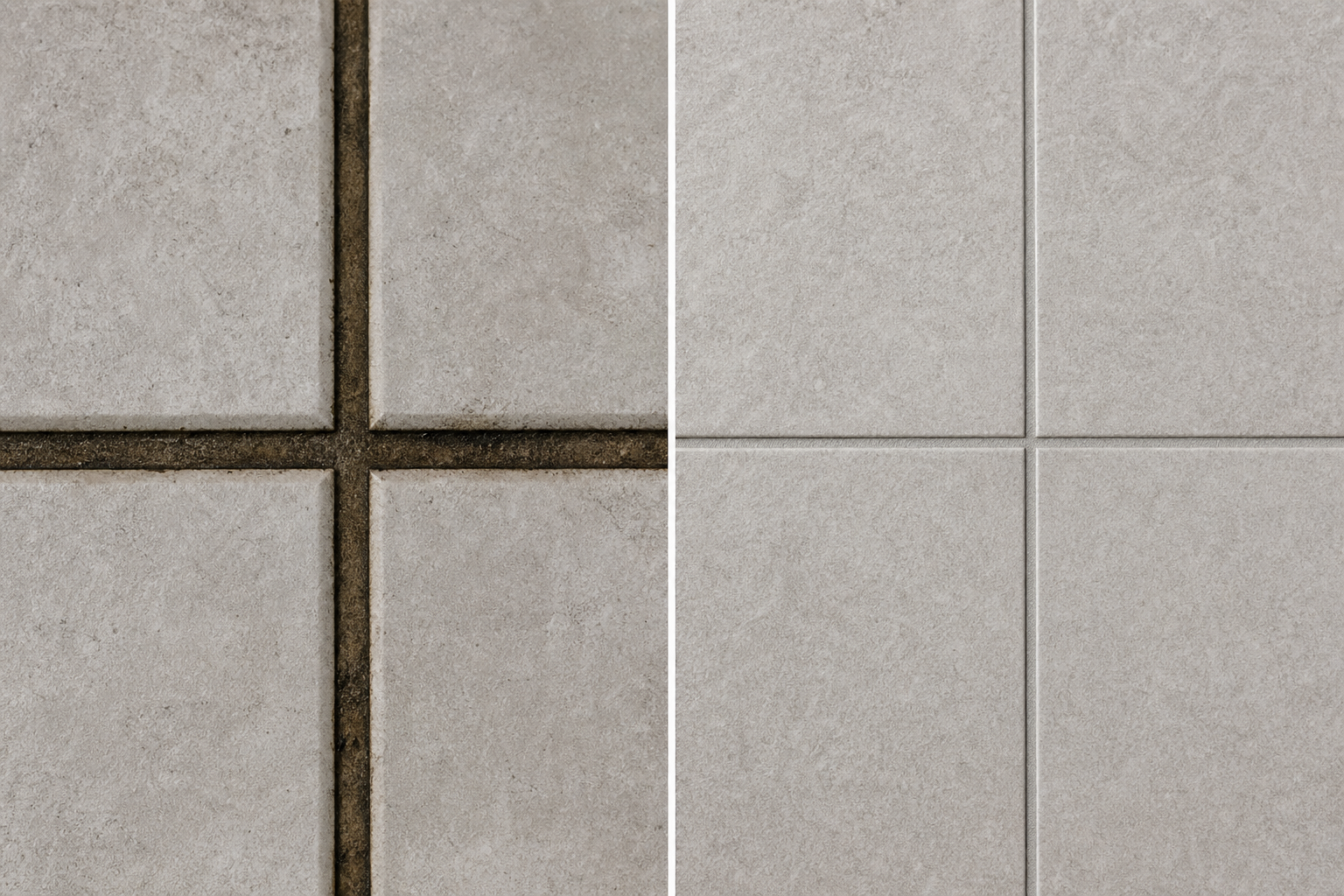
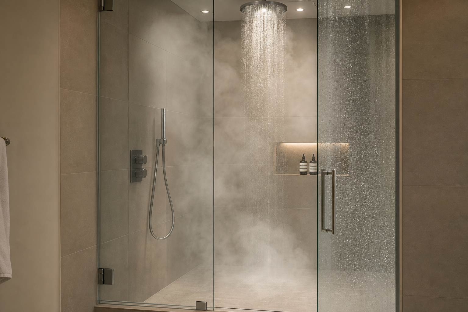
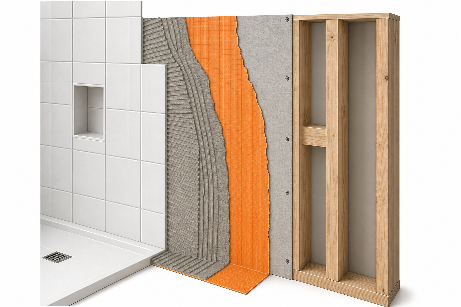
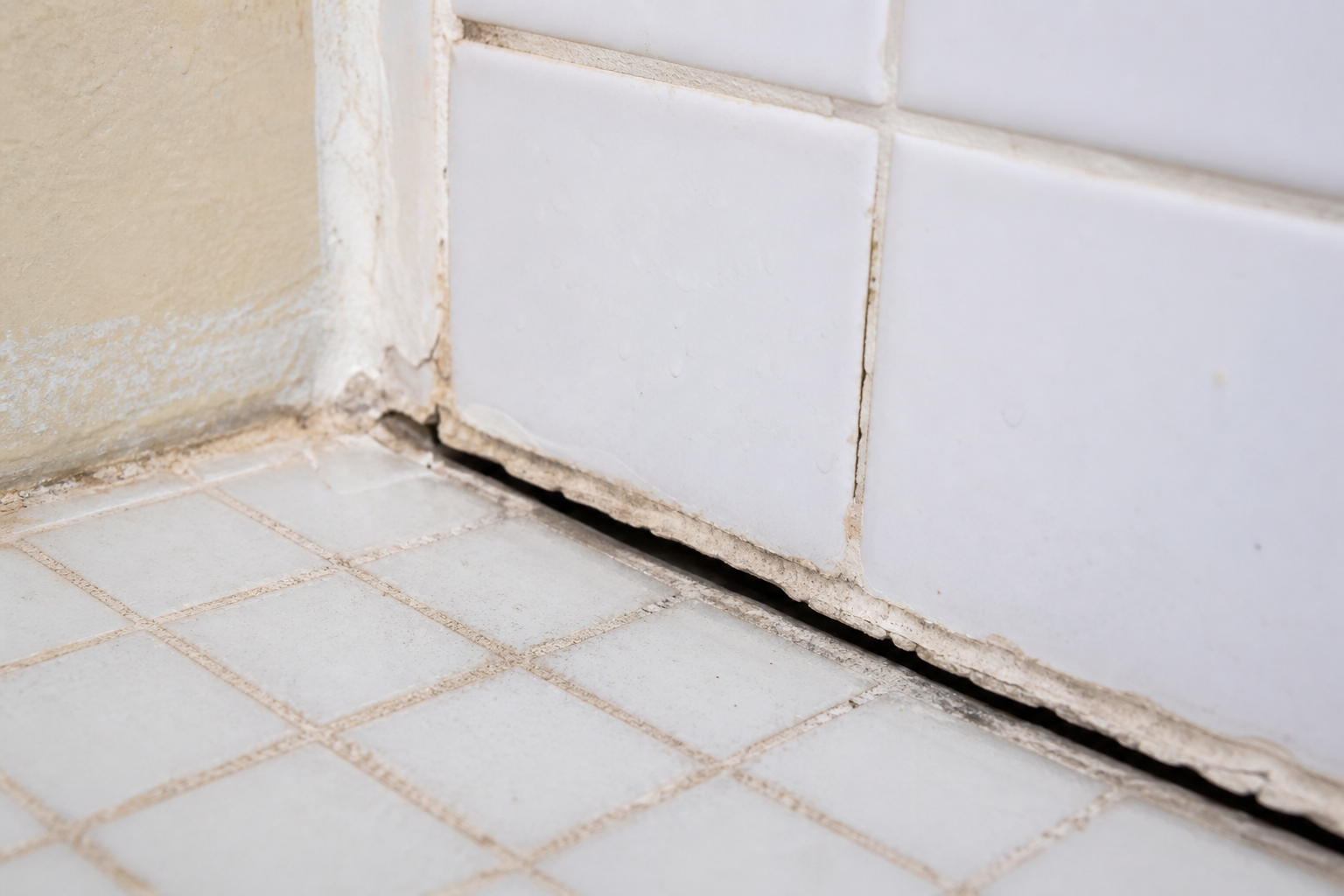
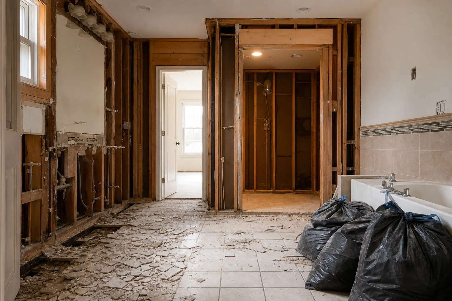
Hard surfaces in small rooms reflect sound. Tile, glass, porcelain, and drywall bounce noise efficiently. Footsteps echo. Water hits the basin like a drum. The exhaust fan vibrates against the housing. Plumbing transmits through the wall when someone showers in the adjacent room. The clinical bathroom is loud by default because nothing absorbs sound.
Acoustic comfort is rarely discussed in bathroom design, yet it determines whether a room feels restful or alert. Bathroom Global, a bathroom design publication, identifies noise reduction as one of the core elements of sensory bathroom design: acoustic tiles and materials that absorb or reduce sound reflection create a quieter environment and enhance the sense of calm.
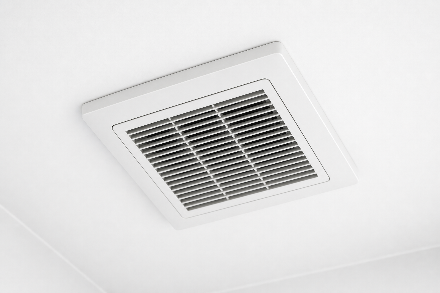
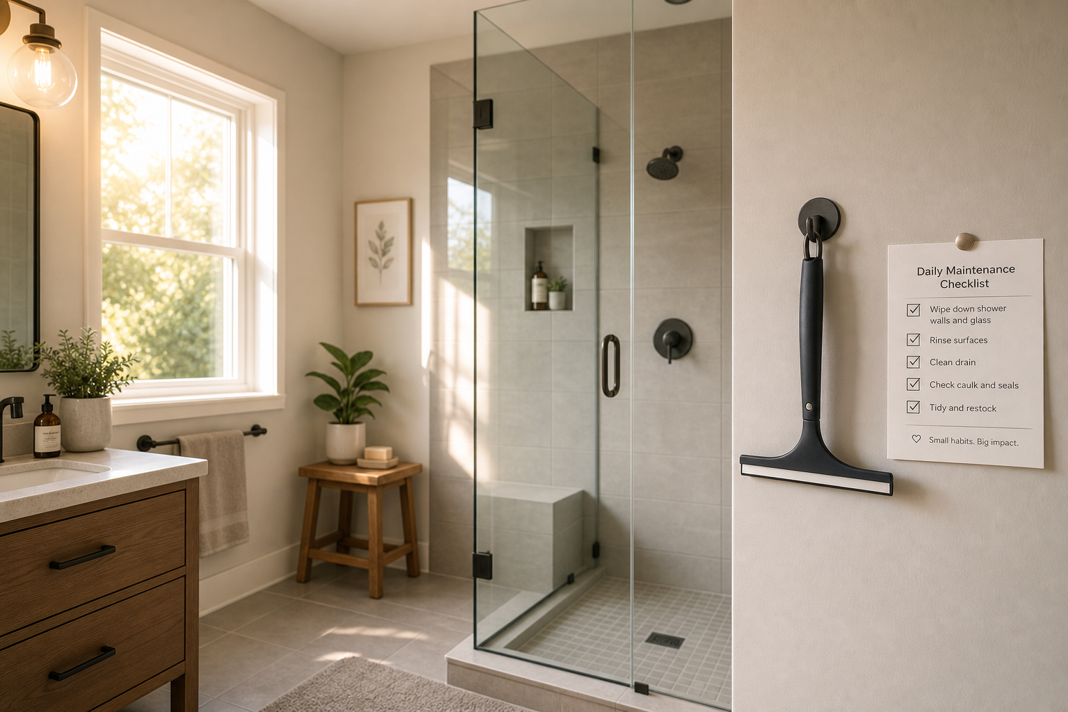
Improvements do not require specialized acoustic tile in most residential bathrooms. Soft-close vanity drawers reduce sharp mechanical noise. Towel bars with rubber bumpers reduce metal-on-tile contact. A bath mat with pile absorbs footfall. A fabric window treatment, where privacy allows, adds absorption. Wall assemblies that isolate plumbing noise from adjacent rooms prevent the shower from announcing itself through the house. Exhaust fans mounted with vibration isolation rather than direct rigid contact reduce the hum that many bathrooms carry constantly.
Echo is the acoustic signature of clinical. A room where your voice bounces back at you feels public even when you are alone. A room where sound dies quickly feels private. Calm is partly acoustic privacy.
Why Spa Accessories Do Not Fix Clinical
The spa accessory approach treats calm as a styling problem. Add a wooden stool. Hang a eucalyptus bundle. Place a candle on the tub edge. Use a rainfall head. These objects appear in calm bathroom photographs because photographers place them there. They do not produce calm in a room that is lit at four thousand Kelvin, tiled in high-gloss white, and echoing like a locker room.
Accessories sit on top of conditions. They cannot override light temperature, material weight, proportion errors, or acoustic reflection. A eucalyptus bundle in a clinical bathroom is a eucalyptus bundle in a clinical bathroom. The room still feels like what it is.
This is why calm bathroom Pinterest boards disappoint. The image shows accessories and materials together. The homeowner copies the accessories and ignores the conditions that made the materials work: warm light, matte texture, correct proportions, soft acoustics. The result is spa props in a clinical shell.
The fix is to address the four variables in order of impact. Light temperature produces the fastest perceptual change. Material weight produces the second. Proportions require construction decisions that are harder to reverse. Acoustics can often be improved without demolition. Accessories come last, if at all.
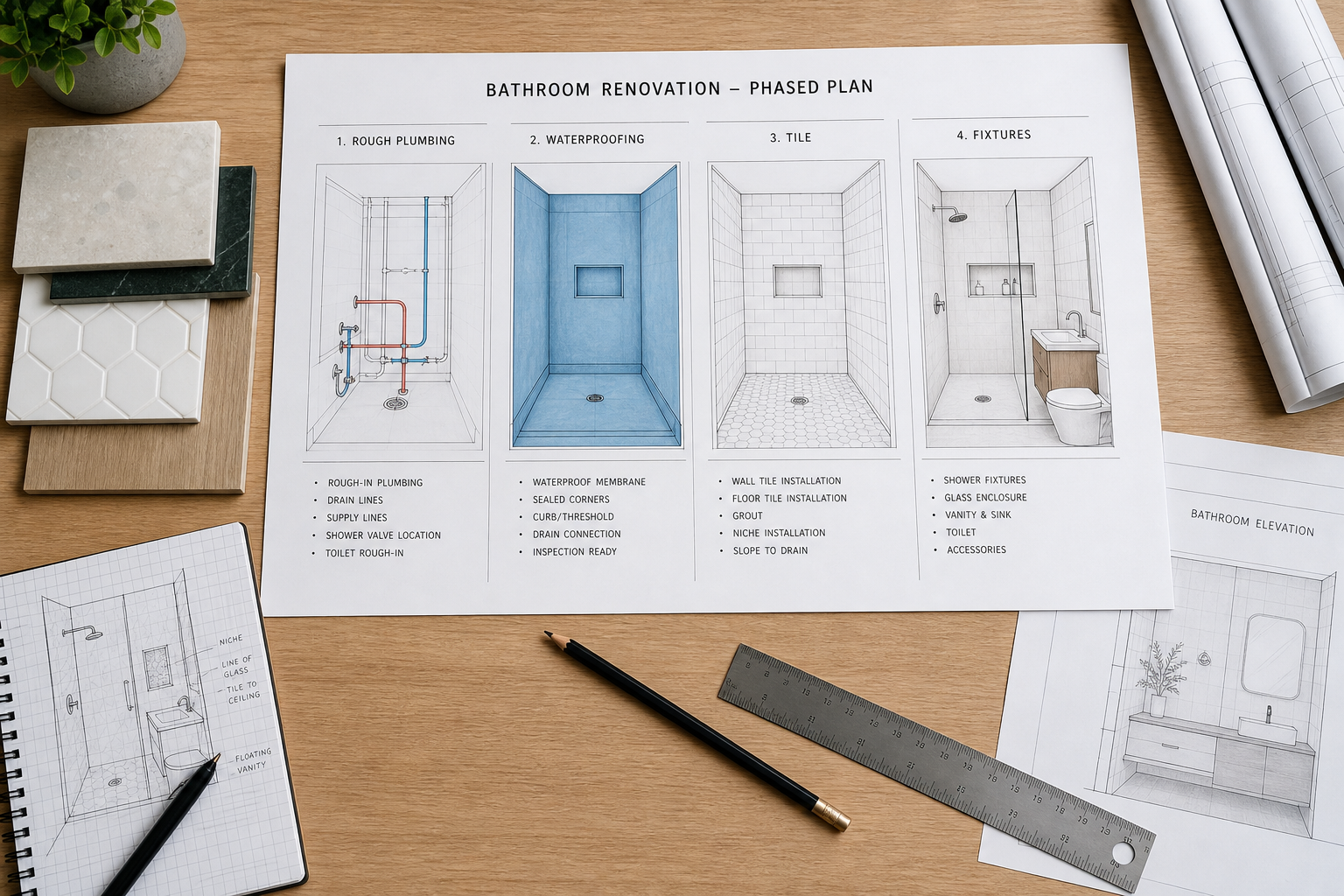
The Sequence for Building Calm
Start with light specification. Document Kelvin temperature, CRI, fixture locations, and dimming capability before any finish is selected. View all material samples under that light. A tile that reads warm under twenty-seven hundred Kelvin may read gray under four thousand. Choose under the light you will live with.
Select materials with visual weight appropriate to the room's size. Small bathrooms can handle less material variety but still need at least one surface with body. Large bathrooms need hierarchy to avoid feeling like an empty gallery. Matte finishes, natural stone or stone-look porcelain, and wood or wood-look cabinetry add presence without pattern noise.
Lock proportions to users before layout is finalized. Measure elbow height, eye height, reach range, and shower standing position. Place fixtures and built elements relative to those measurements. Verify clearances against NKBA guidelines even when code allows less.
Address acoustics during construction when possible: soft-close hardware, plumbing isolation, fan mounting detail. Add absorption through textiles after occupancy if the room still echoes.
When clients describe wanting a bathroom that feels calm, we listen for which version of clinical they are trying to escape. The fix for blue-white light is different from the fix for echo, and different again from the fix for an undersized vanity that makes the room feel like a service space.