Instagram bathroom design looks the same because the platform selects for photographs, not rooms.
This is not an aesthetic judgment about social media. It is a description of how content algorithms work. A platform that distributes images based on engagement metrics rewards the images that generate the most engagement. The images that generate the most engagement are the ones that read clearly, quickly, at a small scale, with enough visual drama to slow a scroll. That set of qualities is not the same as the set of qualities that makes a bathroom good to live in. The platform optimizes for one thing. A good bathroom optimizes for another.
The result is a feedback loop that shapes design choices before a homeowner sits down with a contractor. By the time someone has spent six months casually saving bathroom images, they have absorbed a visual vocabulary assembled not by design professionals applying considered judgment but by an algorithm deciding what competes successfully for attention at 5 a.m. while someone is lying in bed. The algorithm has excellent taste in photographs. It has no preference whatsoever for rooms.
Why Every Instagram Bathroom Has the Same Visual Grammar
The characteristics that photograph well in small formats have been documented by photographers and stylists for decades. High contrast reads on screen; low contrast disappears. Strong geometry signals order and intentionality. A single dominant material gives the eye a resting place. A statement fixture or tile becomes the image's punctuation mark. Open surfaces photograph as luxury. Vertical scale photographs as ambition.
These are all real design qualities. They are also qualities that compress well into a square image on a phone screen.
The problem is not that these qualities are wrong. The problem is that they form a partial list, and an Instagram image is selected by what looks right in the image rather than by what the list leaves off. What the format leaves off is considerable. The smell of inadequate ventilation after a long shower. The maintenance discipline required by open surfaces in a household that actually uses the bathroom. The spatial experience of a room that photographs as generous but is actually tight. The way morning light in a north-facing room differs from the late-afternoon light in which the photograph was taken. None of these appear in the image. The algorithm does not know they exist.
The rooms that win social media's selection process have been optimized, consciously or unconsciously, for the selection process. They are engineered for discoverability. When a homeowner uses those rooms as a design reference, they are importing criteria built for photography into a project that needs to produce a livable space. The translation is incomplete by definition, and the incompleteness shows up not in the first week of a new bathroom but in the second year.
What the Format Rewards That Your Room Does Not Need
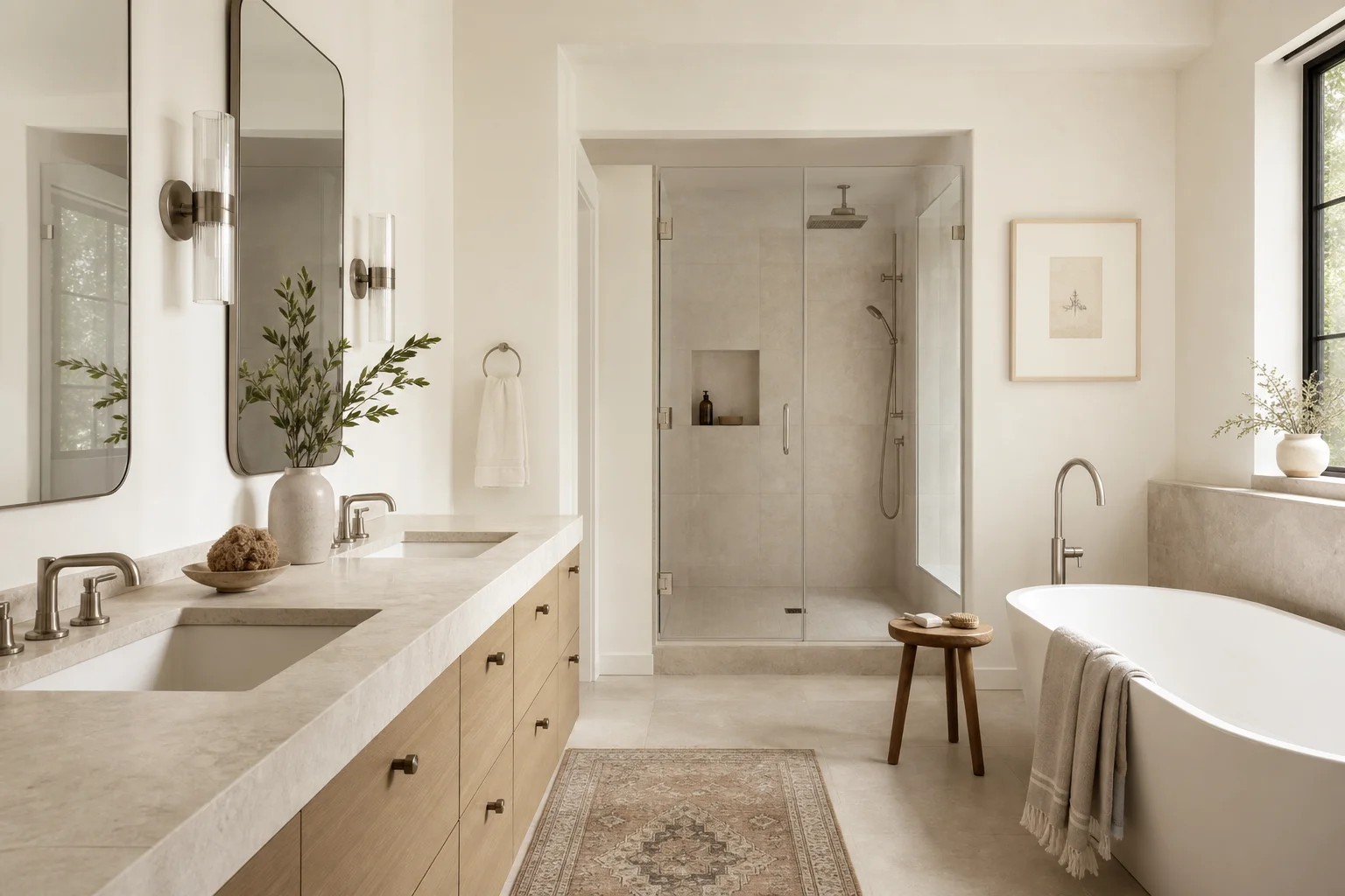
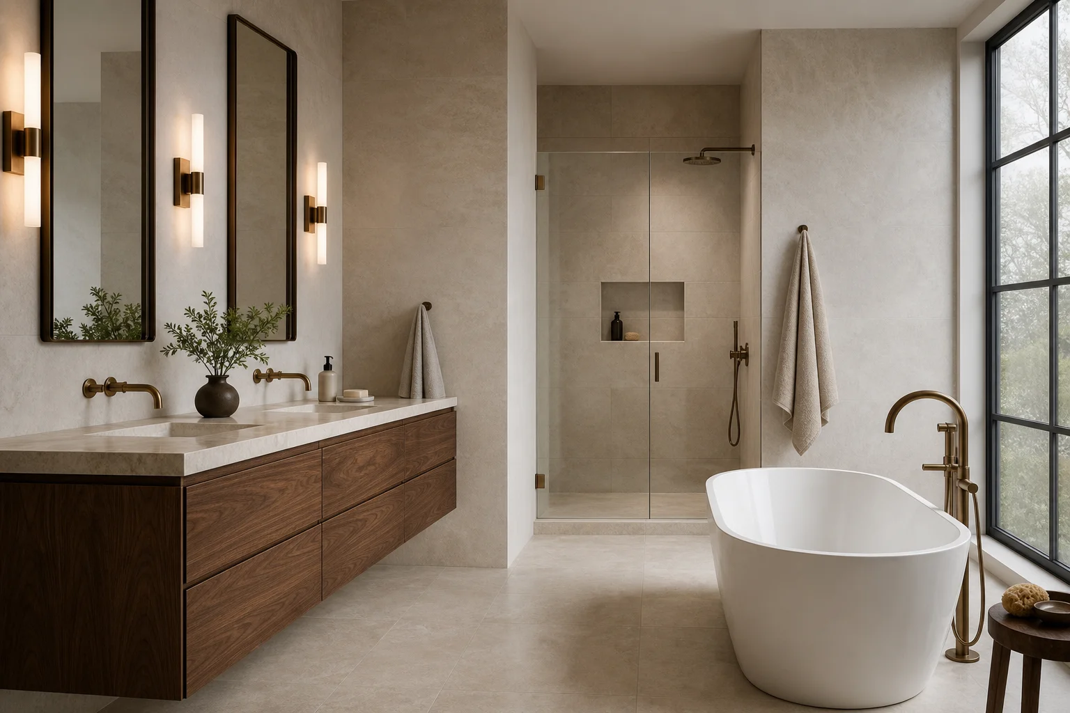
One of the characteristics most heavily rewarded by social media's visual algorithm is material drama: a single material that reads as unusual, expensive, or rare. Veined marble, zellige tile, fluted stone, striated porcelain, travertine with open pores. Each of these materials has real design merit. Each also generates visual interest that compresses well into small formats. They read clearly at thumbnail scale.
What makes them appear continuously across every design-forward bathroom on the platform is not that they are universally appropriate. It is that they reliably photograph. A bathroom with a quieter material palette, where the interest comes from proportion and light and careful detail, does not photograph as forcefully. It may be a superior room to live in. It will receive fewer saves.
The homeowner who builds a board of saved images is, without realizing it, conducting an election among designs selected partly on the basis of their photogenic qualities. The winning candidates are not representative of all good bathrooms. They are the candidates who ran well on this particular platform.
Bold fixtures behave similarly. A sculptural freestanding tub, a wall-mount faucet with a dramatic spout arm, a lit mirror with visual complexity: each produces a clear focal point that anchors a photograph. Daily life rarely requires a focal point in the same location the camera needs one. It requires surfaces that clean, storage that holds what the household actually owns, ventilation that removes moisture, lighting that serves a face rather than a composition.
This is not an argument against sculptural tubs or dramatic tile. It is an argument about the referencing process. When the primary reason a fixture is chosen is that it photographed well, the selection criterion has been borrowed from a system with fundamentally different values than the room being designed.
How to Read an Inspiration Board Against the Grain
The useful information in a board of saved images is not on the surface. It is in the pattern of what a person returns to across images that initially look very different from each other.
Someone who has saved thirty bathroom images over several months has usually saved a dozen genuinely different designs. Marble and walnut. Zellige and plaster. Bold graphic tile. Quiet limestone. Industrial black fixture. Warm brass everywhere. When asked to identify which five images feel most like the bathroom they want to live in, people almost always converge on qualities that cut across materials and finishes: generous proportions, warm rather than cool light, surfaces that suggest a specific provenance, an absence of visual clutter, a room that feels like it belongs to the house around it.
These are not Instagram categories. They are personal categories, and they describe a design direction that is genuinely specific to the person and the house. The referencing process has produced useful raw material. It has just not yet been interrogated for what it actually contains.
The question worth asking of every saved image is not which materials it uses or which fixtures it specifies. The question is: what is this photograph doing that I want my room to do? What quality is it demonstrating that I am responding to? Warmth? Material specificity? A particular proportion? An absence of something most bathrooms have? The ceiling height and the natural light source and the relationship between the vanity and the mirror and the door?
Most of the time, the answer to that question is not about a specific material at all. It is about a relationship between elements, a quality of light, a decision about hierarchy in the room. That answer can be achieved in multiple material vocabularies. The specific material in the photograph is one solution. It may not be the best solution for the actual room.
What Specificity to the House and Household Actually Looks Like
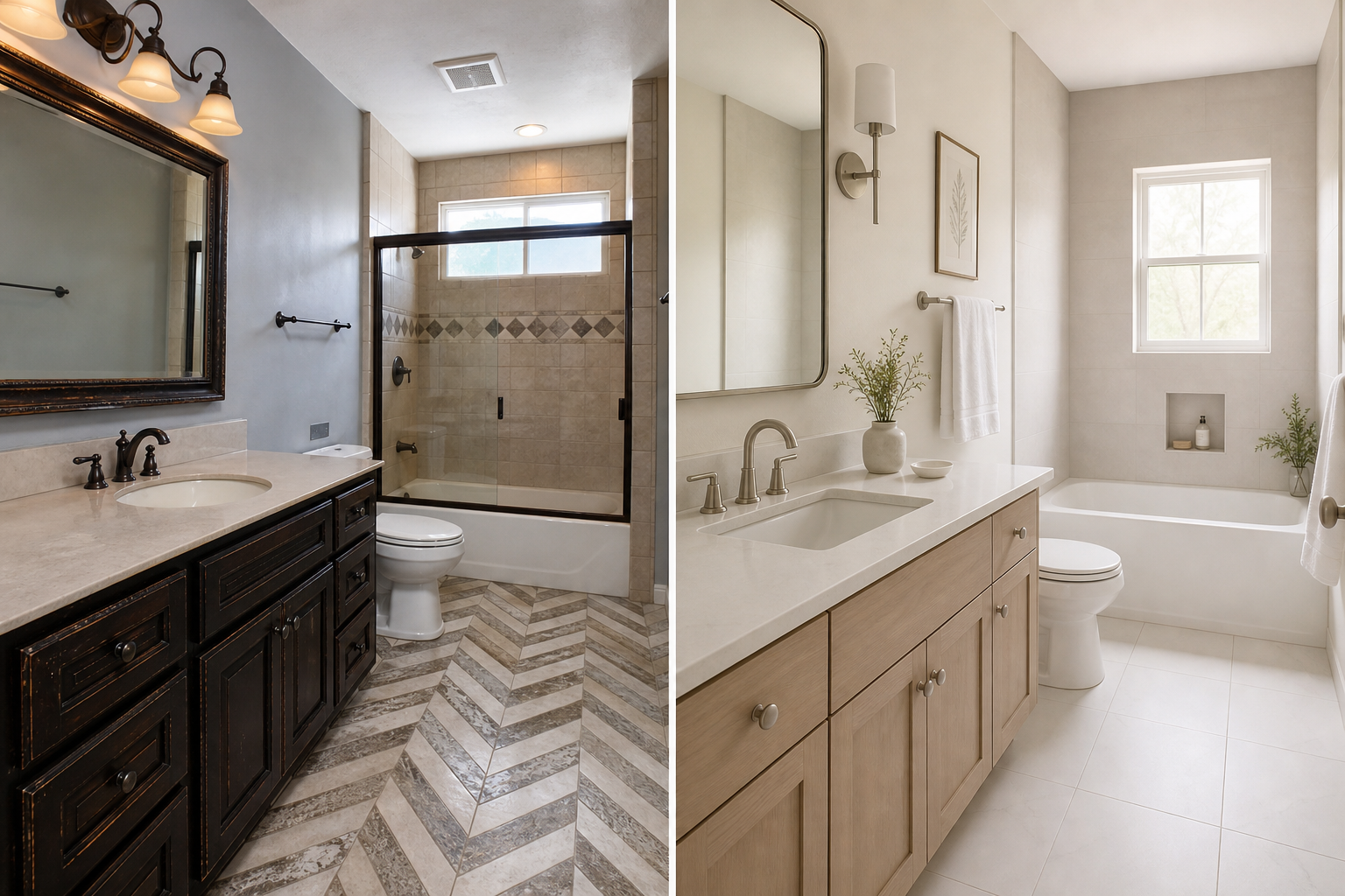
A bathroom that does not look like every other one on Instagram is almost always a bathroom that was designed for something specific rather than for the photogenic categories the platform rewards.
The specificity might come from the house. A home built in a certain decade has architectural proportions and material expectations that leave fingerprints throughout. A bathroom that borrows from those proportions, even loosely, tends to feel of a piece with the house rather than dropped in from a reference board assembled in 2024. The sightlines, the ceiling height, the light source, the way the door sits in the wall: these are design facts the room needs to negotiate. A room built from platform references often ignores them entirely.
The specificity might come from the household. Two people who both wake early and compete for mirror time need a different bathroom than one person with a slow morning routine. A household that takes long showers needs ventilation specified accordingly. A person who keeps twelve skincare products in the shower needs storage designed for real bottle sizes rather than sample-scale niches that look good in photographs. These requirements do not generate interesting content. They are design facts.
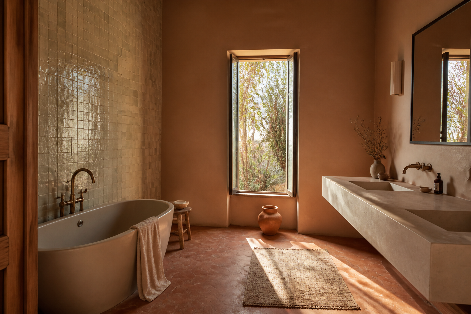
The specificity might come from a genuine material interest that a homeowner can actually articulate. Someone who grew up around handmade objects, or who loves a particular regional building tradition, or who has a real preference for the weight and warmth of natural stone: that preference, followed seriously and consistently, produces a bathroom with a clear point of view. It may not produce the most broadly appealing photograph. It will produce a room that feels intentional in a way that is immediately legible to anyone who enters it.
The rooms that photograph as exceptional on social media, when you look carefully at what makes them actually distinctive, are almost always rooms with this kind of specificity behind them. The unusual quality that makes them stand out is not that the contractor chose a more interesting tile from a showroom. It is that someone made a decision that was specific to the room and not borrowed from a reference board, and that specificity reads.
The Maintenance Question Instagram Never Shows
There is a whole category of design consequence that social media cannot communicate, and it reshapes bathrooms once the photographs stop mattering.
Matte black fixtures photograph as resolved and modern. They also show mineral deposits from every water droplet that dries on the surface, and those deposits require more consistent attention than polished finishes that bead and dry more cleanly. Large-format marble slabs read as sophisticated and quiet on screen. They require periodic sealing and respond visibly to products that are set on the surface without thought. Open shelving photographs as airy and curated. It accumulates product clutter at the rate of actual household activity, not at the rate of staged photography.
None of these trade-offs disqualify any of these choices. All of them deserve to be part of the design conversation, and none of them appear in the images that informed the preference for the choices.
A bathroom designed for the household rather than for the photograph accounts for maintenance honestly. If the person who will use the bathroom is not going to squeegee glass after every shower, the glass enclosure selection should account for that. If the household has hard water, the fixture finish should account for mineral visibility. If the counter is going to hold products rather than a single artisan soap dish, the counter should be sized and drained for that reality.
This sounds obvious. It is consistently the category of information that platform-derived inspiration boards leave out.
One Opinion
Platform-derived design is not a bad starting point. It is a bad ending point.
The moment a material is chosen primarily because it photographed well in someone else's renovation, the household has surrendered its leverage over the room. The room stops being a problem to solve for a specific life and starts being an approximation of an image that solved a different problem for a different life in different light with a different camera. The result is a bathroom that looks recognizable because it is derivative, and looks derivative because it was designed from the outside in rather than from the household outward.
The way out is not to avoid social media references. It is to use them as the beginning of a process of identifying what you actually care about, then designing backward from that care rather than forward from the image.
When clients arrive with an Instagram board, we ask them to identify which images they keep returning to and why. The answer is almost always more specific than "I like the look," and that specificity is where the actual design begins.