A bold tile choice is worth the risk when it is solving a specific problem that a neutral tile cannot solve.
This is a narrower definition than most renovation conversations produce. Bold tile is often discussed as an expression of personality, a commitment to a design aesthetic, or a willingness to move past safe choices. None of those framings are wrong, but none of them explain when bold tile actually works and when it becomes the thing a homeowner spends years second-guessing. The explanation is more functional. When a room has a specific problem that a quieter material cannot address, a bold tile can solve it and earn its presence. When the room does not have that problem, bold tile is decoration looking for a reason to exist, and decoration without a reason tends to wear out its welcome.
The problems worth solving with a bold tile are real, recurring, and spatial in nature. A room that feels unanchored because no element carries visual weight. A wall that reads as leftover space because the room has no focal point to organize the eye. A floor with an awkward proportion that needs a pattern to interrupt the directionality of the space. A room that is correct in every functional sense but feels cold, and where warmth has to come from material rather than from light that the room does not have. These problems exist. Bold tile solves them. The question is whether any of them describe the actual room in front of you.
What Bold Tile Failure Looks Like
The failure mode for a bold tile choice is not dramatic. It is not a room that immediately repels. It is a room that slowly reveals a mismatch between the visual energy of the tile and everything else the room is doing.
The most common version is a statement floor tile under a ceiling and walls that are neutral to the point of inertness. The tile is bold. The ceiling is stock white. The vanity is a standard proportion in a standard finish. The fixtures were chosen for compatibility rather than for a relationship to the tile. The room reads as a room with one strong decision surrounded by a collection of default decisions, and the strong decision starts to feel less like a design choice and more like a correction that arrived without its supporting logic.
This is not a problem with the tile. It is a problem with the process that selected it. The tile was chosen in isolation, from a photograph or a sample board, and installed into a room that was not designed to receive it. A bold tile in a room designed around it reads as intentional. The same tile dropped into an otherwise unremarkable room reads as an impulse.
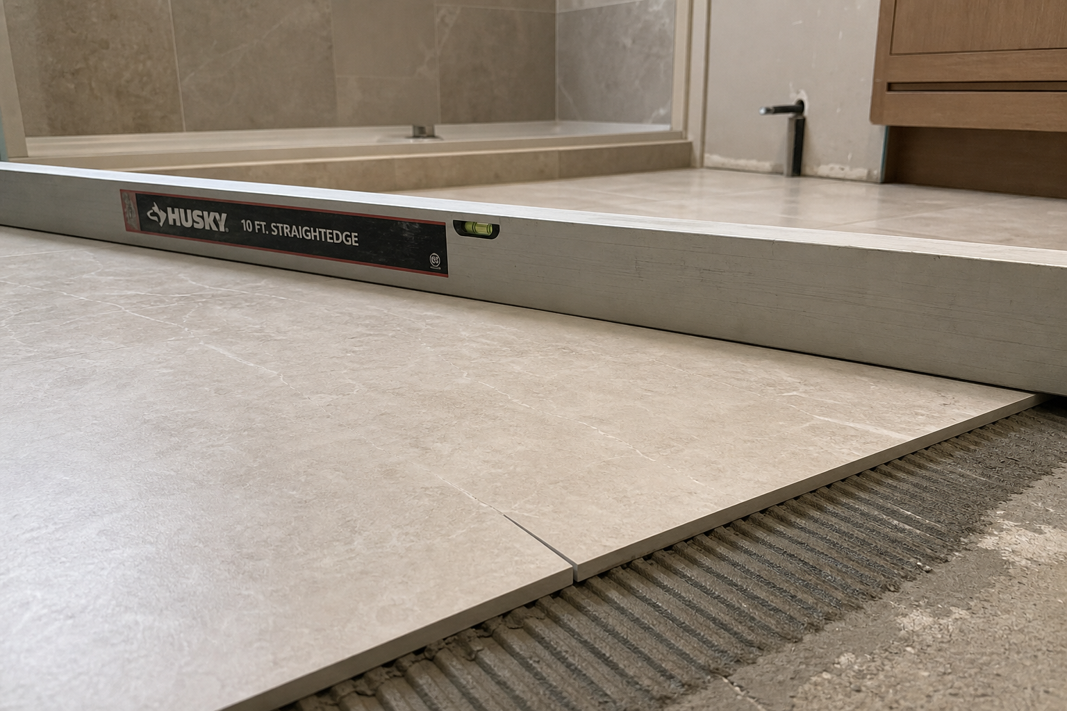
The second failure mode is scale mismatch. A pattern that reads as crisp and energetic on a twelve-inch sample board can overwhelm a small room when it is installed across an entire floor. The visual repeat multiplies across the space. What appeared to add character at sample scale creates spatial anxiety at full installation scale. Conversely, a large-format patterned tile in a generous room can produce the visual frequency the space needs. The sample board does not communicate this. Only seeing the tile in the actual room, at actual scale, does.
The Specific Problems Bold Tile Actually Solves
The case for a bold tile choice begins with a spatial diagnosis rather than a stylistic preference.
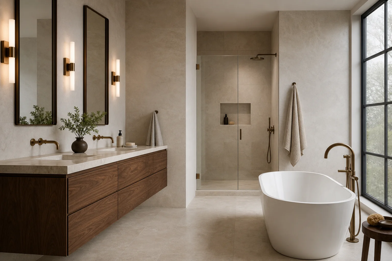
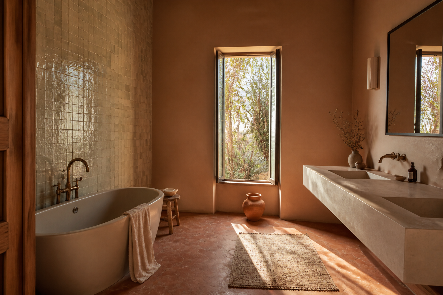
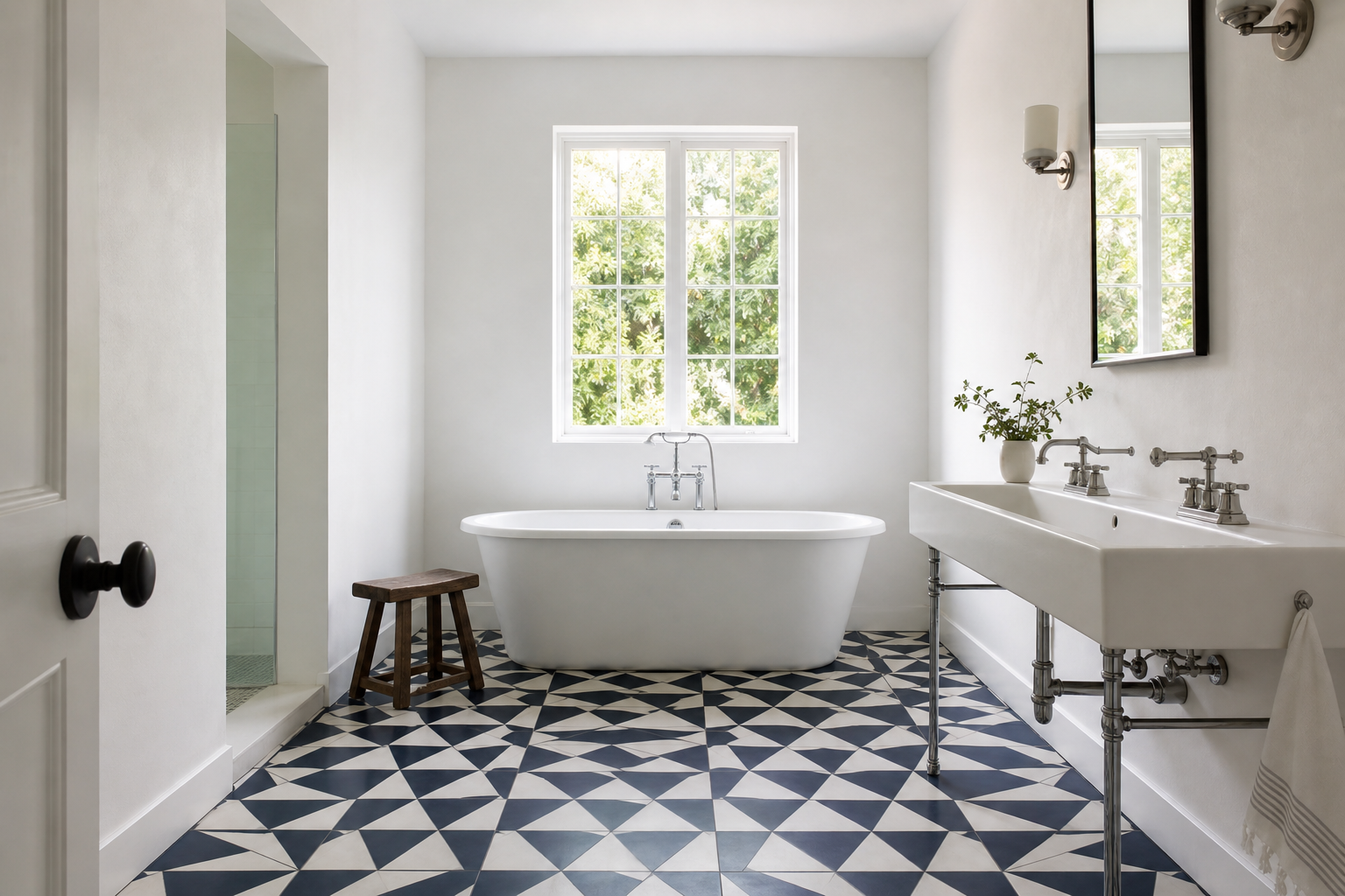
A room that lacks visual weight is a genuine problem. Bathrooms are typically small rooms with high ratios of reflective and smooth surfaces: white walls, glass, chrome, painted cabinetry, plumbing fixtures. In a room with these characteristics, everything recedes. The eye has no place to land. The room feels bright but insubstantial, like a waiting room that happens to have a shower in it. A floor with a strong pattern or a wall with a deeply colored tile gives the room a center of gravity. It creates a surface the eye can rest on rather than slide past. This is a functional outcome, not merely an aesthetic one. The tile is earning its presence by doing work the other materials in the room are not equipped to do.
A room with no focal point has a version of the same problem. Human perception organizes interior space by hierarchy: where does the eye go first, and what does the room communicate about what matters? A bathroom without a focal point is a bathroom where the room has not answered that question. The toilet, the vanity, the towel bar, the shower, and the window compete without resolution. A bold tile behind the shower, or a graphic floor tile that the room's geometry centers, resolves the competition by naming a winner. The room gains structure.
Proportion is a third problem worth addressing with tile choice. A long, narrow bathroom floor calls attention to its own narrowness through the directional pull of grout joints running the length of the room. A tile with a pattern that interrupts directionality or that introduces horizontal movement can alter the perceived proportion of the space without altering the actual dimensions. A small bathroom with a bold floor tile can read as larger than the same room with a standard large-format tile in a neutral color, because the pattern gives the eye something to move through rather than a surface that accelerates visual recession. This is not optical illusion. It is an understood property of how pattern affects spatial perception, and it has been part of architectural tile practice for centuries.
Scale Is the Variable Most Often Underestimated
The relationship between tile scale and room scale is the variable that most consistently separates successful bold tile installations from regretted ones.
Pattern frequency is the key relationship. A small hexagon tile in a bold color-block pattern produces a different visual frequency than a large-format version of the same geometric idea. In a small room, a high-frequency pattern can feel restless because the eye is processing too much information in a confined space. In a generous room, a high-frequency pattern can feel rich and resolved because there is enough space for the pattern to complete its rhythm. The same tile choice can be right or wrong depending entirely on the room dimensions it is installed into.
The relationship between tile scale and the fixtures it surrounds also matters. A strongly patterned floor tile in a room with a floating vanity, a frameless glass enclosure, and simple wall surfaces gives the pattern room to read as the primary design statement. The same tile under a pedestal sink against fully tiled walls in a small powder room may produce visual competition rather than visual richness. Each surface in the room has a visual weight. The designer's task is to ensure that the boldest choice has enough quiet around it to read as a decision rather than as noise.
Grout color belongs to this conversation. A bold tile installed with a high-contrast grout color emphasizes the geometry of the tile layout and increases the visual frequency of the pattern. The same tile with a low-contrast grout color softens the geometry and reduces the pattern intensity, allowing the tile's texture or color to read rather than its geometric structure. This is a meaningful design lever that most homeowners do not know they are choosing when they select grout from a fan deck in the showroom.
The Longevity Question
Bold tile choices invite a version of the longevity question that neutral tile choices do not. The question is not whether the tile will hold up physically, since quality ceramic, porcelain, and natural stone tile perform across decades regardless of pattern or color. The question is whether the visual commitment will hold up psychologically.
The honest answer is that it depends on why the tile was chosen. A bold tile chosen because it photographs well has a different longevity profile than a bold tile chosen because it solves a specific visual problem in the room. The photograph fades in importance after the first few weeks. The spatial problem either remains solved or does not.
A graphic floor tile that anchors a room with no natural focal point will continue to anchor the room in year eight. A heavily patterned accent wall chosen because it was having a moment in renovation media in the year the bathroom was built will start to read as a timestamp well before the tile itself shows any wear. The tile is the same quality of material in both cases. The reasoning behind the choice is what ages differently.
There is also a practical argument for restraint in the boldest choices. A bold floor can be replaced at cost. A bold floor-to-ceiling tile installation in a wet shower environment requires full demolition to change. The rooms where bold tile ages best are often the rooms where the boldness is concentrated at a surface that carries the design but is not the entire room. One decision, made strongly, with quieter materials in support.
The Material Relationships That Complete the Choice
A bold tile in a well-designed room is not the room's only decision. It is the room's strongest decision, and the other decisions are organized in relation to it.
The practical implication is that the tile should be selected before the secondary materials, not simultaneously with them. A homeowner who chooses a graphic floor tile and then tries to select a vanity, wall tile, fixture finish, and grout color at the same time is attempting to negotiate multiple variables at once. The variables are not independent. The vanity selection is a response to the tile. The wall tile selection is a response to the tile. The fixture finish selection is a response to both. Working in sequence, with the bold choice established first, allows every subsequent decision to support it rather than compete with it.
The supporting materials in a room with a bold tile choice have a clear task: to give the bold choice room to read. Materials with strong texture, color, or pattern of their own will compete. Materials that are quiet, consistent, and cohesive will recede appropriately and let the tile perform. This is not a prescription for a boring room. It is a description of visual hierarchy, which is not the same as visual monotony.
Before a client commits to any statement tile, we put the sample in the actual room and look at it for a week. Not a rendering. The sample on the wall or floor, in the light the room gets, at the size the tile will actually be. The decision that survives that test usually survives the renovation.